19 Modern Entryway Decor Ideas

Your entryway sees more daily traffic than almost any other room in the house, yet it’s usually the last space anyone bothers to design on purpose.
These 19 modern entryway ideas came from real hallways that got the small stuff right: backlit mirrors, baskets that swallow shoe piles, benches with actual texture, and lighting that does more than one job at a time.
Some ideas are big swings, like swapping a solid door for full glass or wrapping a mirror in slatted wood.
Others are five minute fixes, like grouping mismatched vases or tucking a basket under a shelf you already own.
What ties them together is that none of them rely on expensive renovations. A floating shelf, a warm bulb, a stool you can slide out of sight, that’s often all it takes.
Whether you’re working with a long narrow hallway or a wide open foyer, there’s something here you can copy this weekend.
Scroll through, save your favorites, and start with whichever one solves the problem bugging you most right now.
19 Modern Entryway Decor Ideas
1. Skip the Table: A Floating Console Shelf Frees Up Your Floor
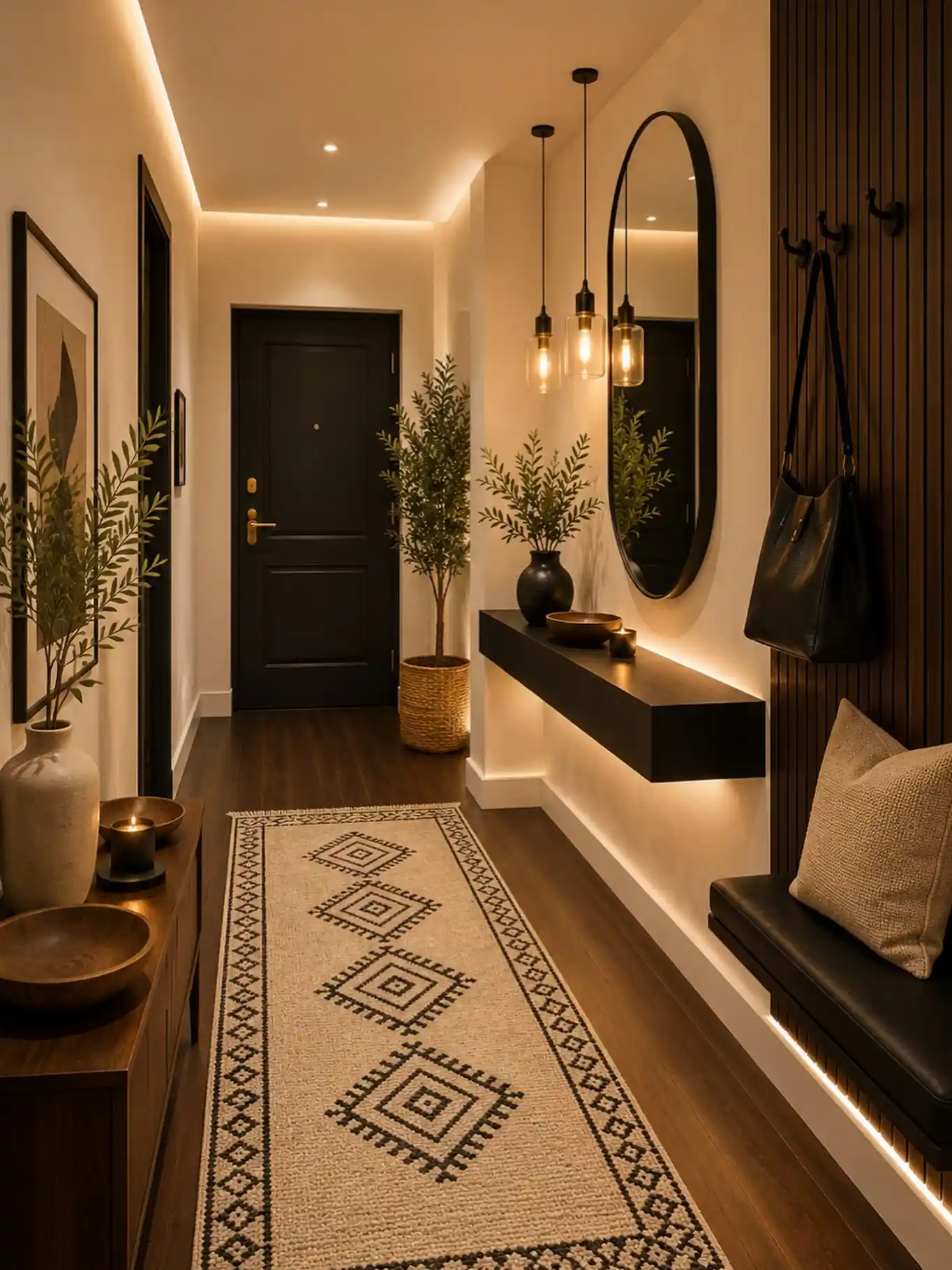
That slim black shelf mounted straight to the wall is doing more work than a regular console table ever could.
No legs means no bulky footprint eating up hallway space, and the hidden LED strip tucked underneath makes the whole thing look like it’s floating an inch off the floor.
This trick works best in narrow entryways where every inch of walking room matters. A few things make it read as intentional instead of empty:
- One dark ceramic vase with a couple of loose branches
- A shallow wood bowl for keys or a candle
- Nothing sitting directly on the floor beneath it
2. Light the Mirror From Behind for a Built In Glow
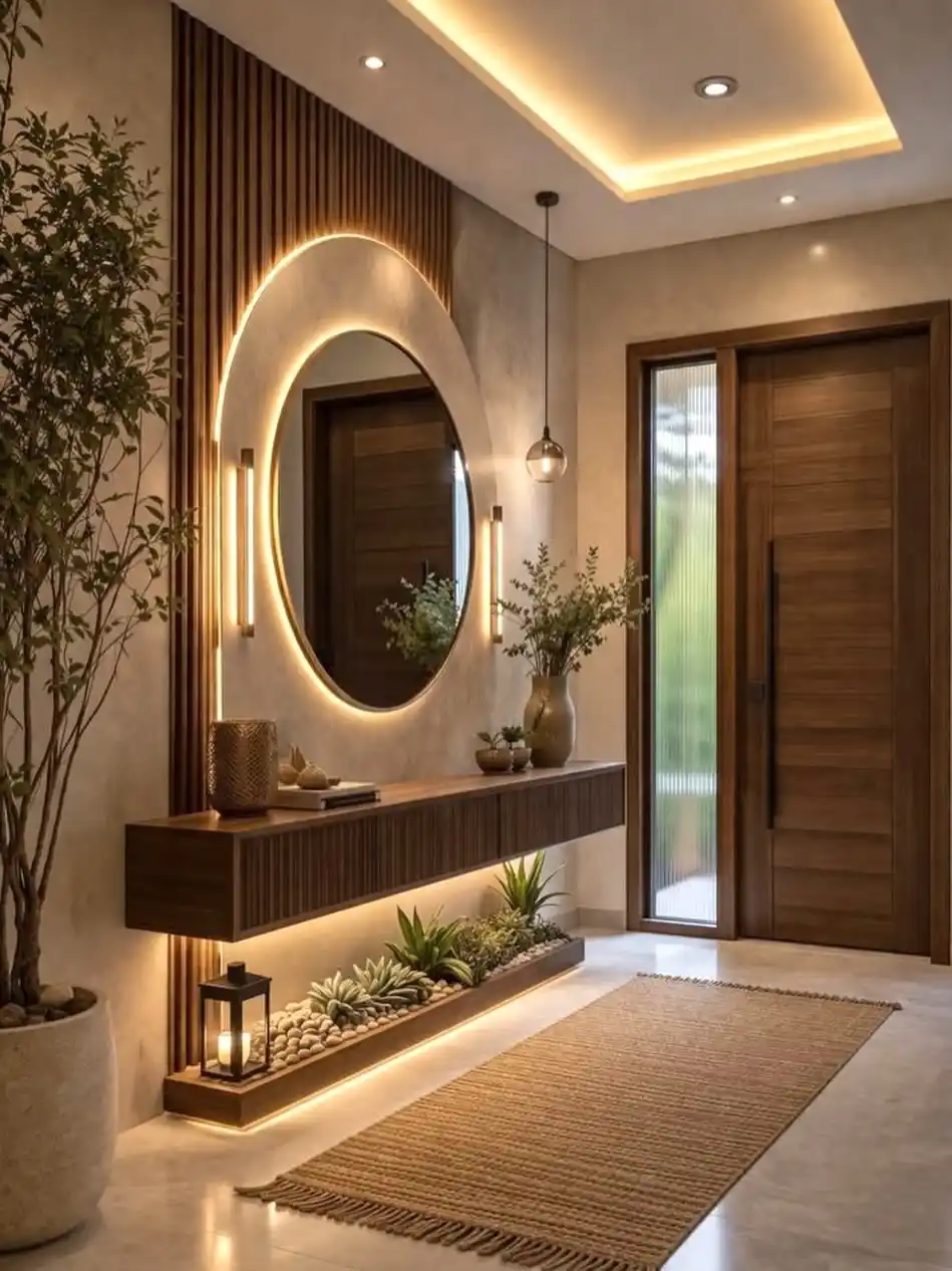
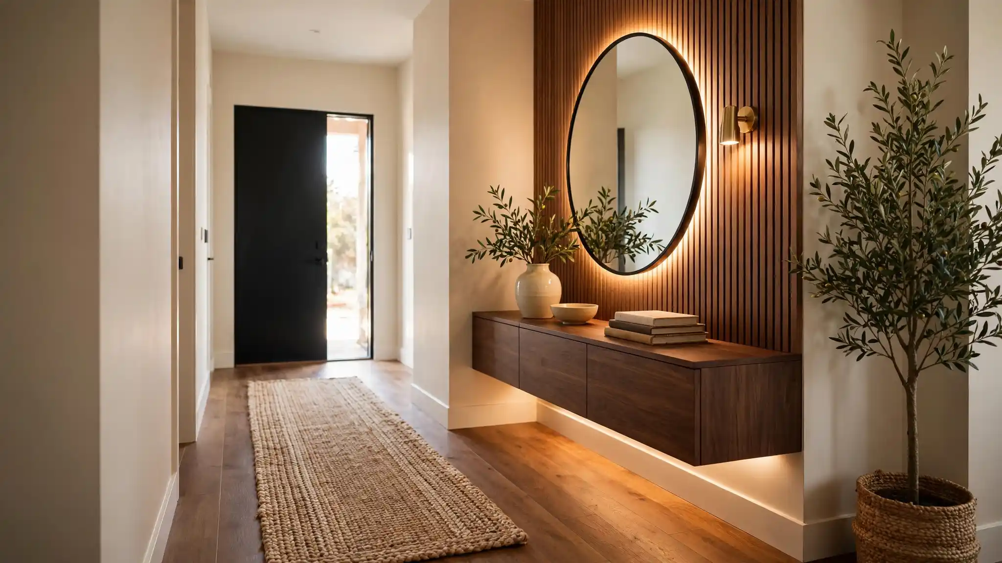
That backlit arch around the mirror is the real trick here. Instead of a lamp on the console, the light source is hidden in the wall itself, framing the mirror in a soft ring that makes the whole nook feel like a lit alcove instead of a flat wall.
Slim vertical wall sconces on either side add just enough extra warmth without competing with it.
Here’s how to bring that look home:
- Mount an LED strip or ring light behind the mirror frame so the glow spills out around the edges instead of shining forward.
- Add two slim sconces flanking the mirror at roughly eye level to fill in shadows on the wall.
- Keep the console dark and matte so the light bounces off the wall, not the furniture.
- Finish with a low pebble or plant strip under the shelf to catch the glow at floor level.
Run an LED strip around the frame edge so light glows outward, not forward.
Two vertical fixtures at eye level fill in shadow without overpowering the mirror glow.
A matte dark wood surface lets the wall light do the work instead of reflecting it back.
A pebble and succulent bed beneath the console catches the ambient light at floor level.
3. An Oversized Woven Pendant Can Replace a Whole Light Fixture Debate
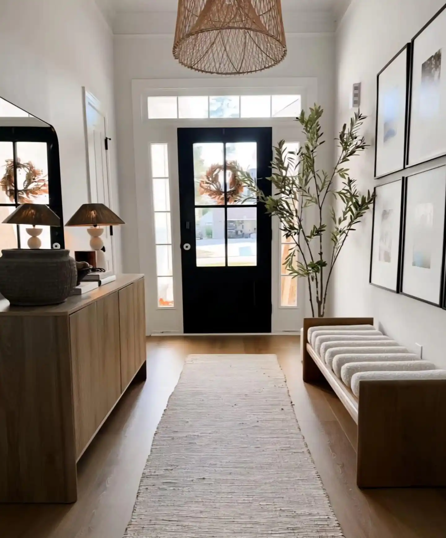
Overhead lighting in a hallway usually gets skipped or forgotten, but that huge woven pendant hanging center stage proves it can carry the whole entry.
Paired with the black paneled door below it, the contrast between the natural texture up top and the dark, structured door creates a focal point the second you step inside.
What makes this pairing work:
- A large scale, textured fixture instead of a small flush mount
- Warm rattan or rope material against a cooler, darker door tone
- Just one statement light, not a cluster of small ones
If your ceiling feels bare or your entry light is an afterthought builder fixture, this is the easiest swap to make a real difference.
4. Light the Stair Risers, Not Just the Hallway Ceiling
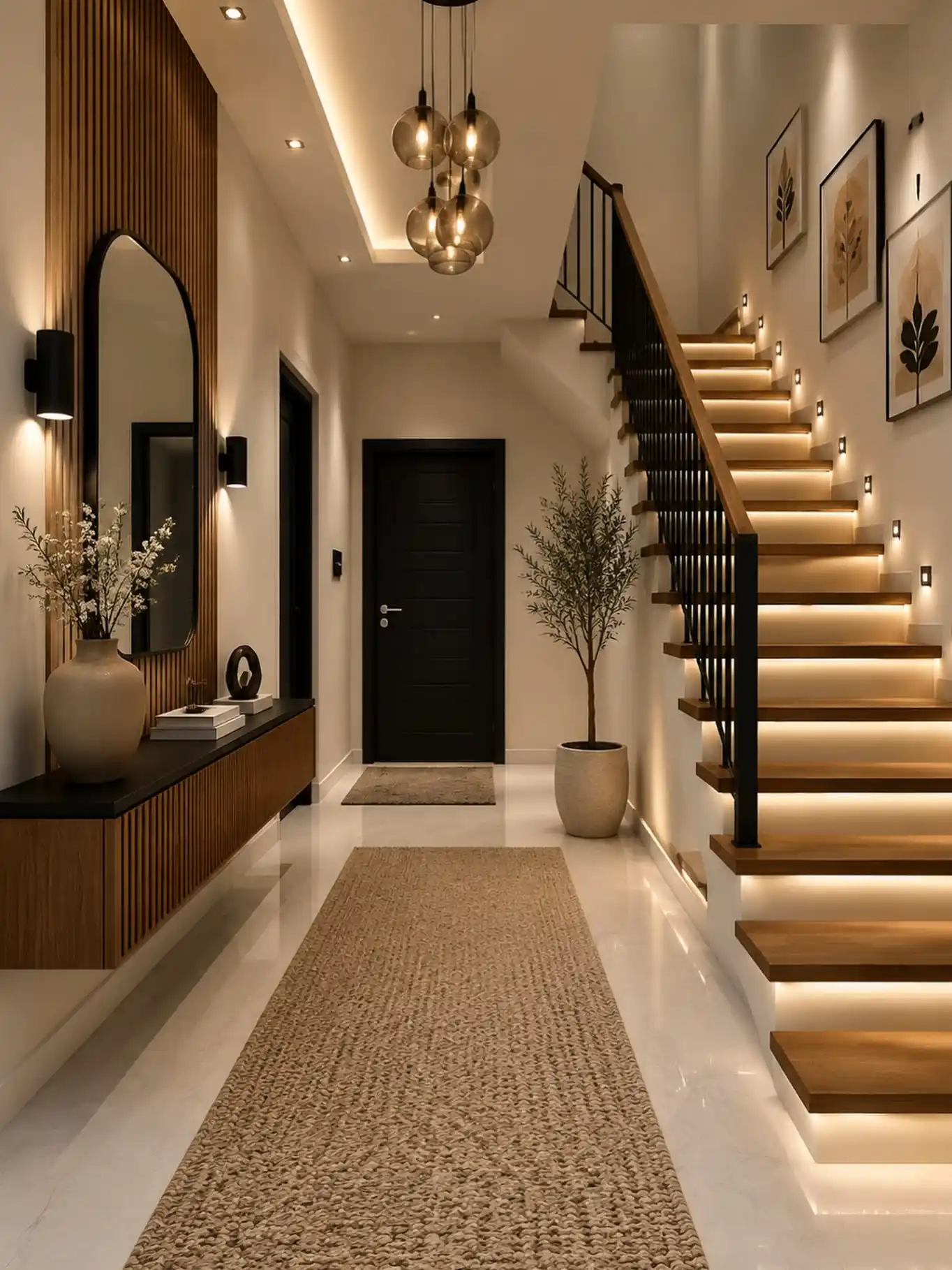
Look past the glass globe pendants for a second and check out the staircase. Every single step has a warm LED strip tucked under the tread, so the light spills forward instead of glowing from above.
It turns a plain staircase into something that looks lit on purpose, and it makes the whole entry feel bigger because your eye keeps traveling up instead of stopping at the front door.
Small wall sconces along the stair wall add a second layer, so no one step relies on a single light source. It is a detail most builders skip, which is exactly why it stands out here.
Run a warm LED strip under the lip of each tread so light falls forward onto the step below.
Add small wall sconces every few steps to fill in shadows on the vertical wall.
Relying only on a ceiling fixture at the top of the stairs, which leaves lower steps dim.
Using cool white bulbs here, which clashes with warm wood treads.
5. A Woven Basket Tucked Under the Shelf Solves the Shoe Pile Problem
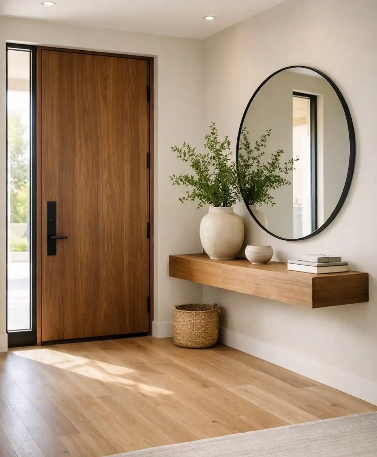
Round mirrors and floating shelves get all the attention in entryway photos, but the real functional move here is low and easy to miss.
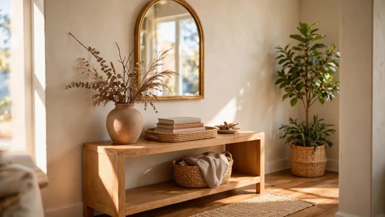
That woven basket sitting on the floor under the console gives you a spot to kick off shoes or stash a scarf without cluttering the shelf above it.
It works because it stays low, out of sight lines, and matches the warm wood tone instead of standing out.
What makes this pairing feel finished instead of thrown together:
- The basket sits directly under the shelf’s edge, so it reads as part of the design instead of an afterthought.
- Its natural weave tone matches the console wood, keeping the whole corner in one warm palette.
- The shelf above stays clear for display only, a vase, a small bowl, a stack of books, while storage lives underneath.
Sitting right under the edge, it reads as one built in unit, not a random floor item.
Subscribe to DIY Craft Bloom
Get updates on the latest posts and more from DIY Craft Bloom straight to your inbox.
The basket’s natural color echoes the console, so nothing fights for attention.
Keeping the top clear for a vase and books, the clutter moves to the floor instead.
6. Paint Just the Coat Wall a Moody Color to Mark the Drop Zone
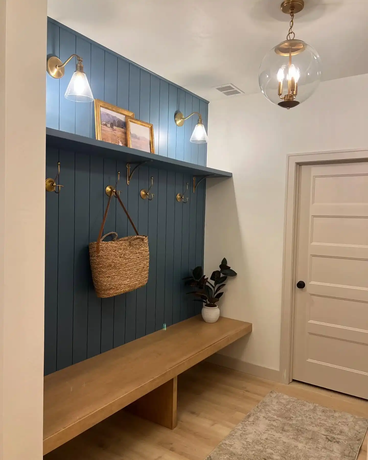
Instead of painting the whole entry, this mudroom nook committed to one wall. The slate blue shiplap panel does double duty: it defines exactly where coats, bags, and hooks live, and it makes the brass hardware pop hard against it.
White walls surround it on every side, so the color reads as a deliberate zone instead of a full room commitment.
Brass sconces mounted right on the paneling add task lighting for the shelf above without needing a separate fixture, and the warm wood bench grounds the whole cool blue tone so it doesn’t feel cold.
One accent wall goes further than a full repaint. Pick the wall your hooks and shelf actually live on, and leave the rest of the hallway neutral so the color stays a feature, not a theme.
7. Group Vases in Three Different Heights Instead of Matching Sets
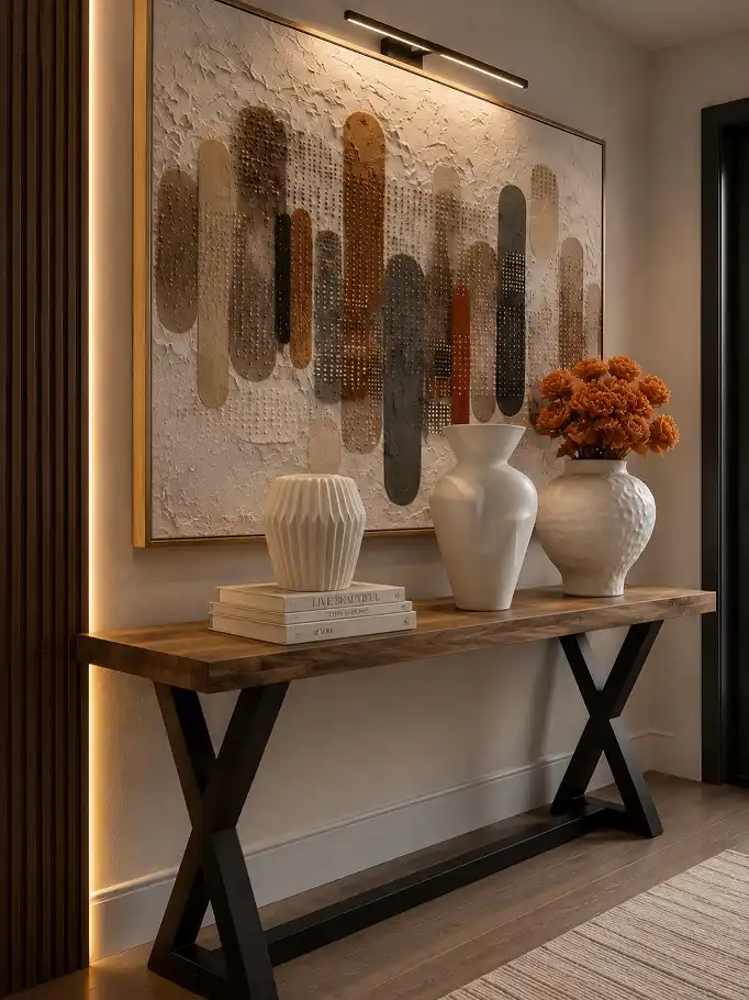
Textured wall art gets the eye first, but the real styling lesson sits on the console below it.
Three white vases, each a completely different shape and height, create rhythm without looking like a matched set from a store display.
A short stack of books breaks up the row so it’s not just objects lined up in a straight line.
The lighting bar mounted above the art is doing quiet work too, washing the textured piece in a warm glow so the raised surface actually casts shadows instead of flattening under overhead light.
- Pick vases in varying heights, never a matching trio
- Add one low object, like books, to break the eye line
- Mount a picture light directly above textured or 3D art
8. Frame a Photo Grid With Vertical Light Bars Instead of Regular Sconces
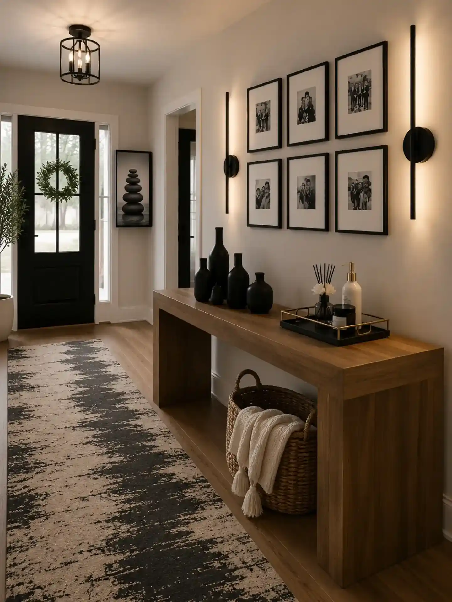
Six matching black and white photos in a tight two by three grid could look like a dorm room gallery wall.
What saves it here is the pair of slim vertical light bars mounted on either side, which turn the whole arrangement into one glowing unit instead of six separate frames stuck to a wall.
The linear shape echoes the frame edges too, so nothing feels randomly placed.
Below it, a cluster of matte black bud vases in varying heights picks up the same black frame color, tying the wall and the console together without repeating a single object twice.
A woven basket with a folded throw sits in the open shelf underneath, giving the console a second job as blanket storage for chilly walks in from outside.
Vertical light bars frame a grid of frames, turning six photos into one cohesive fixture instead of a scattered collection.
9. Frame the Whole Nook With Vertical Wood Slats, Not Just a Mirror
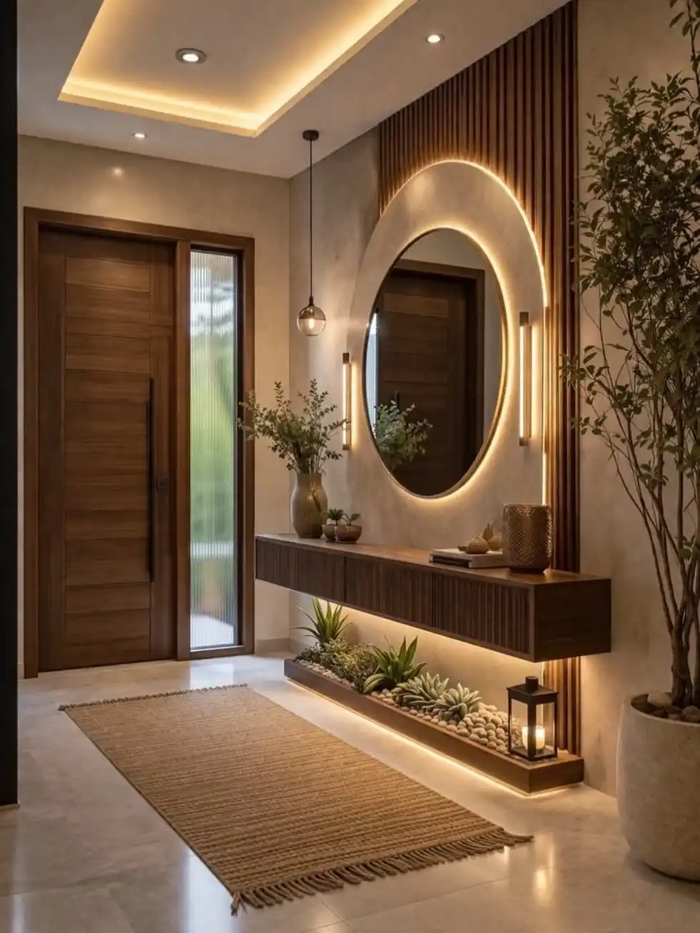
A round mirror is common enough on its own, but wrapping it inside a full slatted wood panel is what turns this corner into an actual architectural moment instead of a hung accessory.
The ribbing runs floor to ceiling, so your eye reads the mirror as part of the wall’s structure rather than something added on top of it.
An oversized potted tree next to the nook adds enough height and scale that the whole corner feels like a designed room, not a leftover hallway wall.
Down at floor level, a small lantern with a real candle sits beside the planted succulent trough, picking up the same warm glow as the backlighting above.
It’s a tiny detail, but it means the light story continues all the way to the ground instead of stopping at the mirror.
10. Pair a Tall Bench With a Low Side Table for Instant Height Contrast
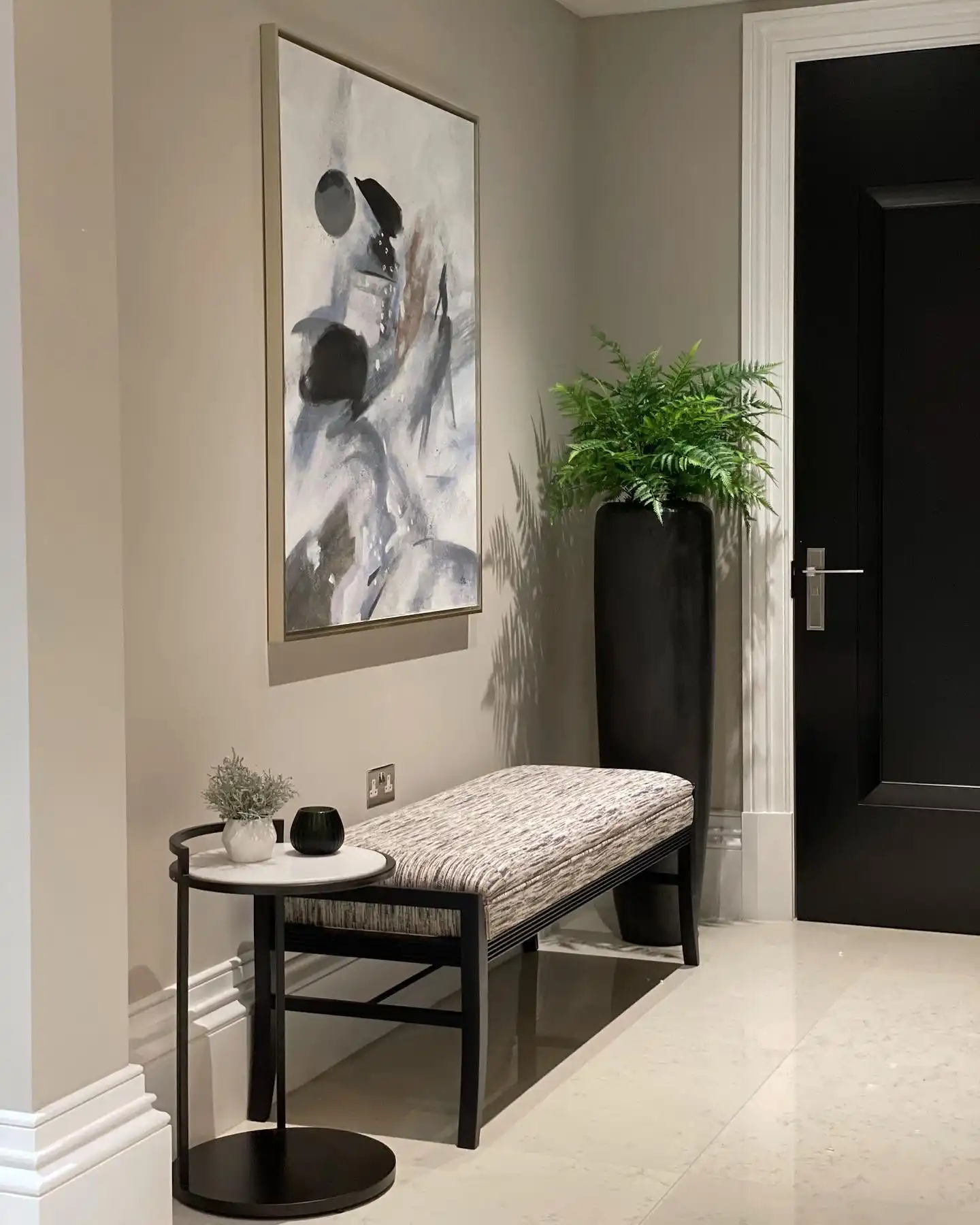
Furniture that all sits at the same height tends to look flat in photos, even when every piece is beautiful on its own.
Here, the upholstered bench sits noticeably higher than the round side table beside it, so your eye moves up and down the vignette instead of skimming across one flat line.
The oversized black planter on the other side pulls the same trick vertically, stretching the whole corner taller than the ceiling height alone would suggest.
| Bench | Side Table |
|---|---|
| Sits at a taller seat height for landing or resting | Sits low, closer to coffee table height |
| Wide upholstered top for sitting to put on shoes | Small round surface just for a plant or catchall |
| Nubby woven fabric adds softness | Smooth stone top adds contrast |
11. A Channel Tufted Bench Doubles as Seating and a Design Moment
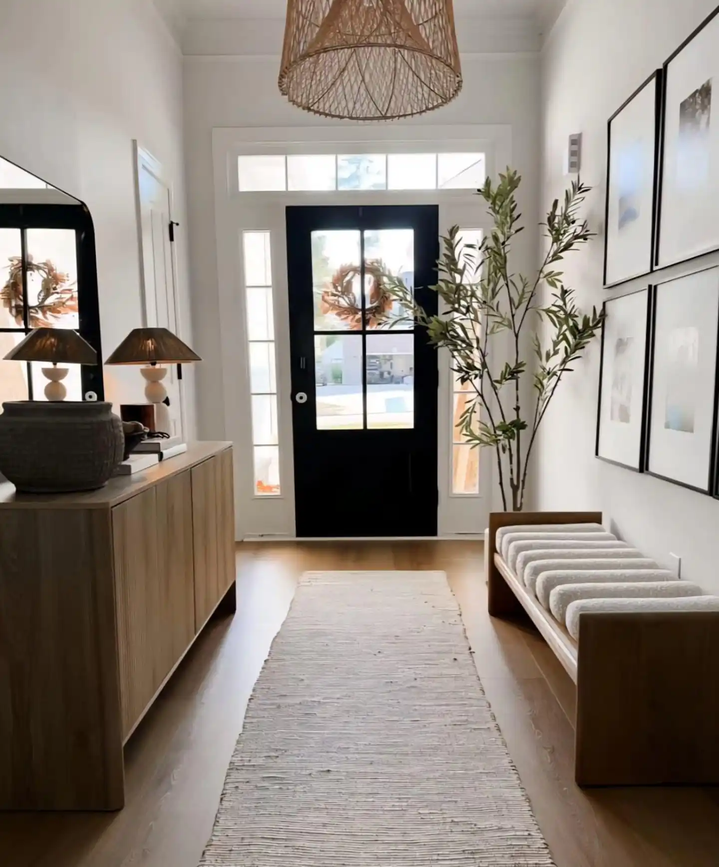
This is the same hallway as an earlier image, but the low bench along the right wall deserves its own callout.
The vertical channel tufting on the seat cushion catches light differently than a flat cushion would, giving it texture and visual interest even from a distance.
Raised on a simple wood frame, it reads as furniture rather than a built in, which makes it easy to swap out later if your style shifts.
A few reasons this bench earns its spot:
- Channel tufting adds texture without needing a pattern
- A light gray fabric keeps it from competing with the black and white gallery wall above it
- Sitting low and open beneath, it never blocks the sightline down the hallway
12. Let a Console Table’s Drawers and Baskets Split Your Storage in Two
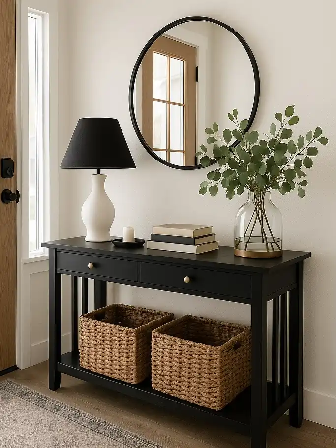
A console table with actual drawers is rare in most entryway roundups, but it changes everything about how much you can hide.
Mail, keys, and sunglasses go in the top drawers, while two woven baskets on the open shelf below swallow shoes, gloves, or a spare blanket. It’s a two tier storage system disguised as a single piece of furniture.
Up top, a black lamp with a matte shade grounds the vignette against an oversized round mirror, while trailing eucalyptus in a clear glass vase keeps things from feeling too heavy or too dark.
13. A Slatted Wood Panel Can Work Double Duty as Wall Art and a Coat Rack
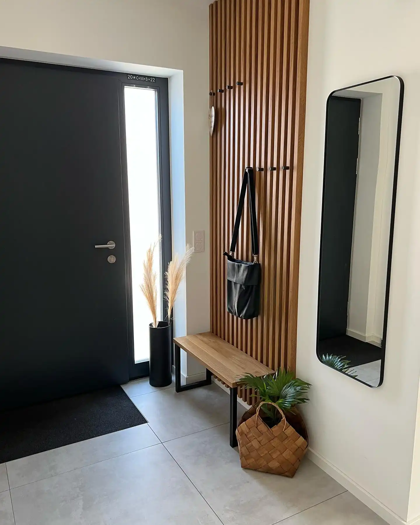
No console table, no shelf, just a single slatted wood panel doing everything at once.
Small black hooks are drilled right into the slats, so bags and coats hang against the wood grain instead of a flat painted wall, and the whole panel reads as a design feature even when nothing is hanging on it.
Subscribe to DIY Craft Bloom
Get updates on the latest posts and more from DIY Craft Bloom straight to your inbox.
A slim bench underneath gives you a place to sit, and a floor length mirror on the opposite wall keeps the narrow entry from feeling boxed in.
The vertical grain texture fills the wall on its own, no artwork needed.
Empty hooks nearly disappear against the slats, so the wall stays tidy looking.
Placed across from the entry, it bounces light and visually doubles the hallway width.
14. Line a Console’s Open Shelf With Matching Baskets to Skip Cabinet Doors
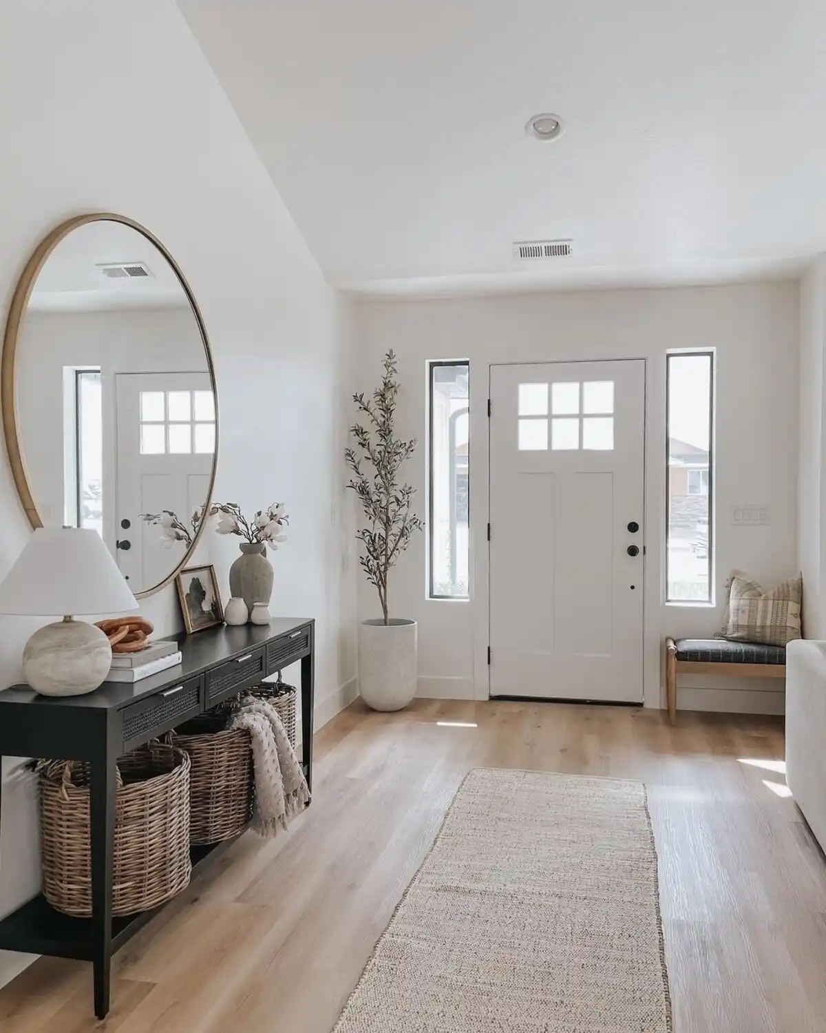
Three same-size wicker baskets slide under this console shelf like they were built for it, turning open shelving into closed storage without adding a single cabinet door.
Everything hides at floor level: shoes in one, a folded throw in another, gloves and scarves in the third, while the tabletop above stays clear for a lamp, a stack of books, and a small vase.
Across the room, a slim upholstered bench with one throw pillow gives the entry a second landing zone entirely, so guests aren’t forced to crowd the console side to sit down and swap shoes.
Match your baskets to your shelf width and they’ll read as built in storage, not add ons.
15. Swap One Traditional Chair for a Row of Little Stools Instead
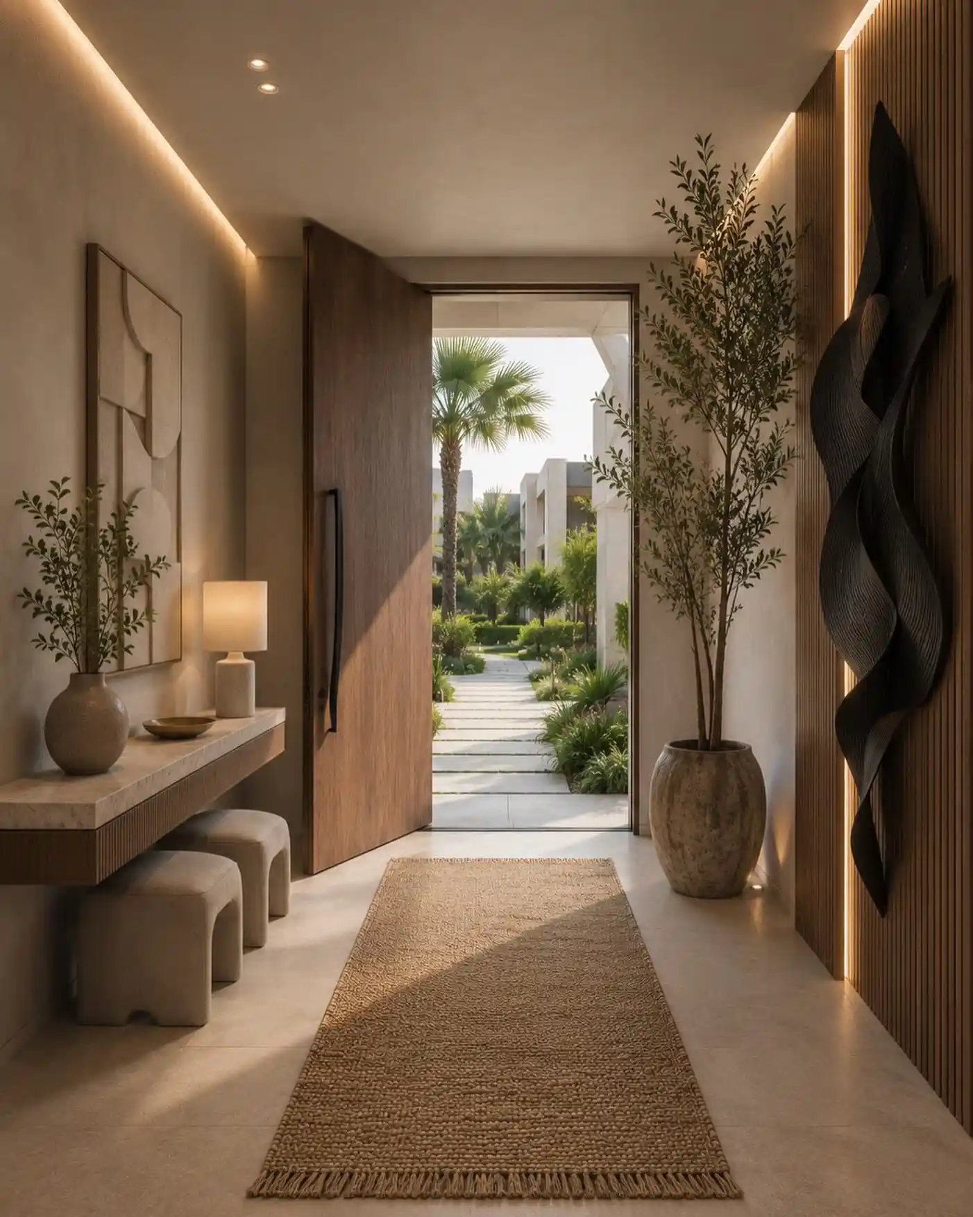
Rather than a bench or a single accent chair, this entry lines up three small rounded stools under the console.
Each one stays low enough to tuck completely out of sight when not in use, and having three instead of one means a whole family can sit down to put on shoes at the same time without crowding.
Their soft, pebble-like shape softens all the straight lines in the hallway, the console edge, the door panel, the tall vase, which otherwise would feel a little rigid stacked together.
- Skip one bulky chair, use two or three small stools instead
- Pick a rounded, organic shape to soften a hallway full of straight edges
- Slide them fully under the console when not needed
16. Paint the Wall Behind Your Mirror a Deep Sage to Warm Up Wood Tones
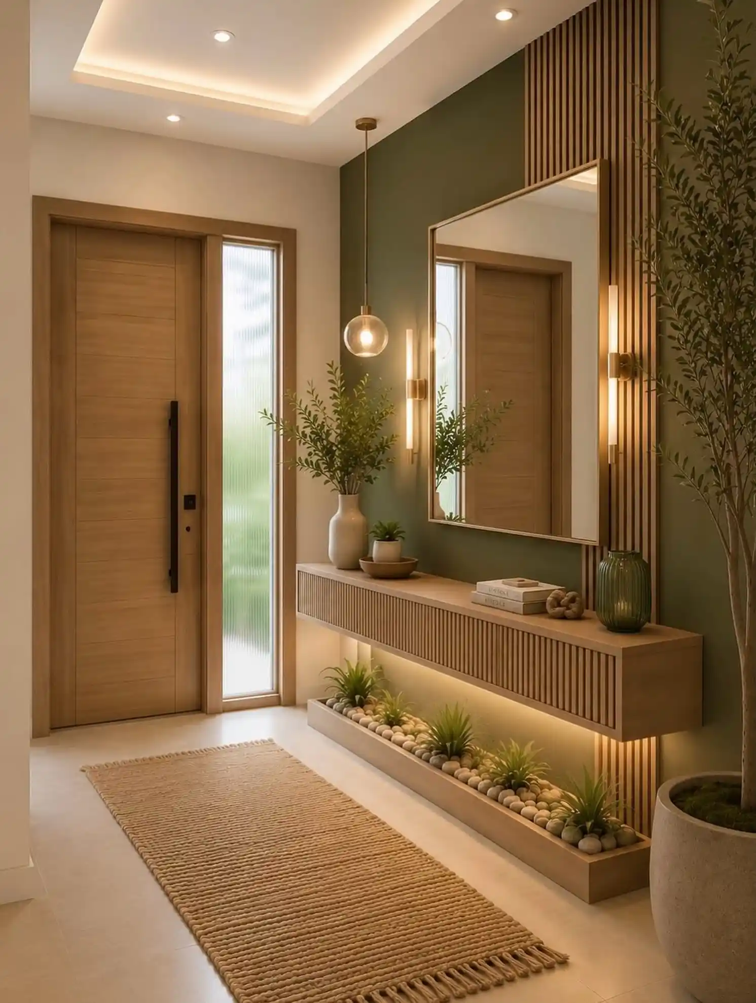
Every wood finish in this hallway, the door, the console, the vertical slats, leans warm and golden.
What stops it from blending into one another is the muted sage green painted just behind the mirror and lighting.
It’s a small strip of color, but it’s enough contrast to make the wood tones read as intentional layering instead of one flat wash of brown.
A single glass globe pendant hangs at a different height than the wall sconces flanking the mirror, so the light sources stagger instead of lining up in a row.
That staggered height is subtle, but it keeps the wall from looking like a symmetrical showroom display.
| Sage Wall Zone | Neutral Wall Zone |
|---|---|
| Muted olive green paint | Warm off white paint |
| Sits behind the mirror and sconces | Covers the rest of the hallway |
| Adds contrast against the wood tones | Keeps the entry feeling open and bright |
17. A Glass Front Door Turns Your Entry Into an Extension of the Garden
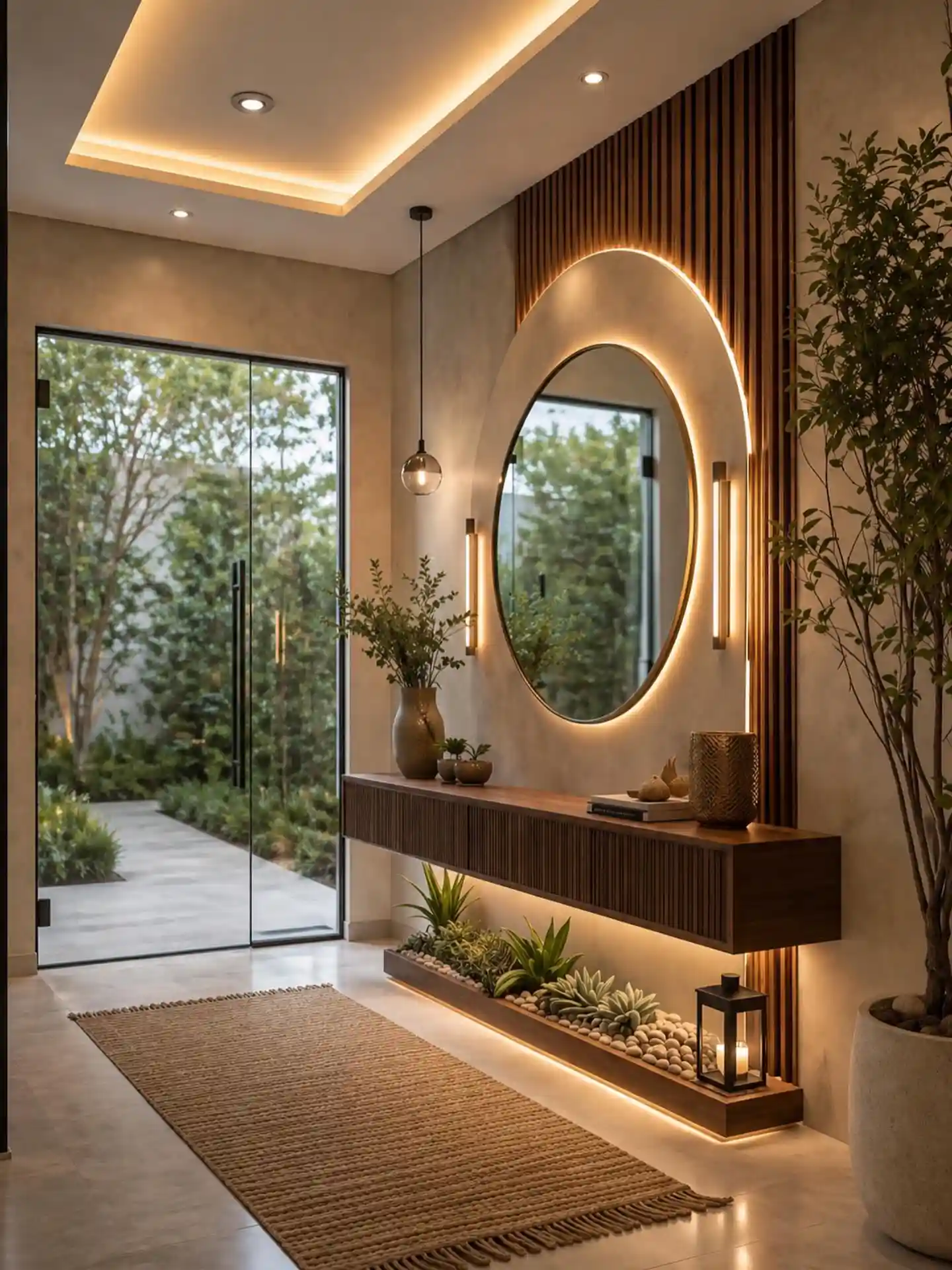
Most of these ideas focus on what’s inside the hallway, but this one is about what’s not blocking the view.
A full glass door swapped in for a solid one means the entryway borrows the greenery outside as part of its decor, no artwork needed on that side of the room at all.
Walking in, your eye goes straight through to the trees before it even lands on the mirror or console.
It also solves a lighting problem for free. Instead of relying only on the warm overhead fixtures and backlit mirror, real daylight pours in during the day, so the space reads differently morning versus evening without changing a single bulb.
A full glass door only works this well with real privacy behind it, a fenced yard, a courtyard wall, or tall greenery. Without that buffer, you’re trading decor for a lack of privacy.
18. Uneven Frame Sizes in a Grid Keep a Gallery Wall From Feeling Stiff
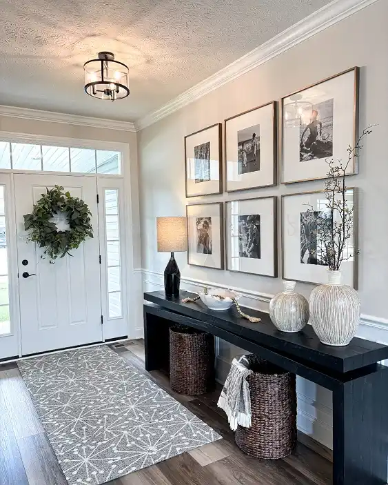
This six photo grid looks similar to an earlier gallery wall entry, but look closer and the frames aren’t all identical, one runs noticeably taller and wider than the rest.
That single size break stops the whole grid from feeling like a factory template and gives your eye a spot to land first before it moves through the rest of the photos.
Below it, a pair of textured white vases with ribbed and fluted detailing pick up the crown molding’s texture on the wall, and a bare branch in one vase adds height without needing real flowers.
Two dark woven baskets tucked under the console handle the practical side, towels, throws, whatever needs a home, staying low so they never compete with the wall above.
Six identical frames in a perfect grid, tidy but a little flat.
One larger frame breaks the rhythm and gives the grid a natural focal point.
19. Pair a Sculptural Console With Equally Sculptural Wall Art
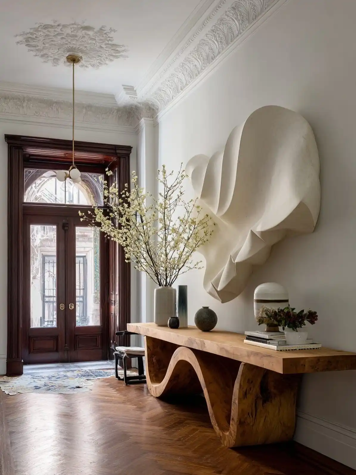
Straight lines are nowhere in sight here, and that’s the whole point. The console’s wavy, hand carved base curves like a ribbon, and the oversized plaster wall piece above it echoes that same folded, fabric like movement.
Neither one is a simple rectangle, so together they turn the wall into one continuous sculptural statement instead of furniture plus decoration.
Ornate crown molding and a herringbone floor could easily clash with something this modern, but the warm wood tone bridges old and new so the whole entry feels layered instead of mismatched.
A tall vase of flowering branches softens the sculpture’s stark white curves without stealing focus from either piece.
conclusion
A good entryway doesn’t need to be big or expensive, it just needs a few details that actually work for how you live.
Pick two or three ideas from this list, start with lighting or storage since those tend to make the biggest difference fastest, and build from there.
Save this for the next time you’re standing in your hallway wondering where to start.