16 Fall Wreath Ideas for the Front Door

Every fall wreath roundup shows you the same five silhouettes reshuffled. Grapevine base, mums, a plaid bow, done.
After going through dozens of real front door photos, a different picture came together, one where the interesting choices happen in the materials and the color story, not just the flower count.
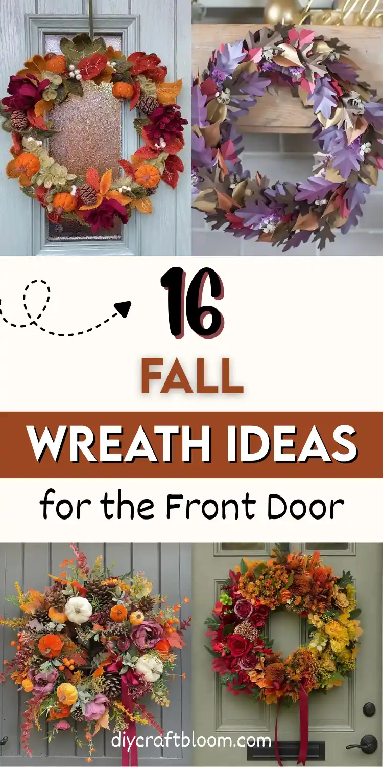
These fall wreath ideas cover felt and paper builds that never wilt, dried arrangements in muted champagne and blush, a full palette shift into blue hydrangea or green apples, and a few that lean maximalist on purpose with four oversized peonies or one giant pumpkin doing all the work.
Some skip fresh greenery entirely. Others build a welcome sign right into the base instead of hanging one separately.
What ties all sixteen together is intention. Nothing here reads as a wreath grabbed off a shelf and hung without a second thought.
Each one makes a specific choice, in color, in texture, or in what gets left out, and that choice is what makes it worth copying. Scroll through and pull whichever direction fits your own door best.
16 Fall Wreath Ideas for the Front Door
1. A Braided Macrame Wreath With Frosted Berry Wings
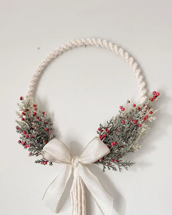
Rope and cord is not just for plant hangers anymore.
This one skips the usual grapevine or grass base entirely. A thick braided macrame cord forms the ring, and two soft sprays of frosted greenery and red berries sit low near the bottom instead of wrapping the whole circle.
A wide ivory bow with a fringed tassel tail anchors the center and gives the whole thing a handmade, textile feel.
A few things make this version worth copying:
- The braid pattern on the cord adds texture even before you add a single stem
- Frosted or flocked greenery reads as fall going into winter, not summer leftover
- Keeping the florals to two side clusters instead of a full ring makes the wreath feel lighter and less crowded
- A linen bow with visible fringe does more work than a bow tied from ribbon alone
2. A Fully Layered Felt Wreath With No Bare Spots
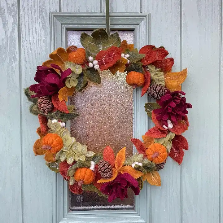
Felt wreaths solve a problem real greenery cannot: they never look thin by November.
Every inch of this one is covered. Burgundy felt mums sit next to mustard and rust colored oak leaves, with a few plump felt pumpkins tucked into the gaps.
Pinecones and small cream colored berries fill whatever space is left, so there is no visible base ring anywhere.
The palette leans deep and warm rather than bright orange, which reads more like October moving into November.
What works here:
- Mixing flower shapes with leaf shapes keeps the eye moving instead of settling on one pattern
- Felt pumpkins add weight and shape that flat leaves alone cannot give
- Pinecones break up the fabric texture with something rougher
- A tight, no gap layout means the wreath still looks full even on a wide door
Burgundy and rust instead of bright orange feels more late fall than early October.
Felt pumpkins and mums break up what could otherwise be a flat, one note ring.
Pinecones and berries fill every leftover gap so the ring never peeks through.
3. A Paper Leaf Wreath That Skips Green Completely
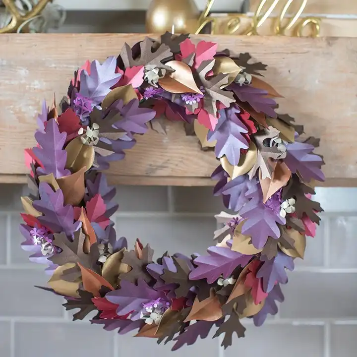
Purple, dusty rose, bronze, and warm grey. Not a single leaf here is actually leaf colored, and that is the whole point.
Cut from cardstock in a mix of finishes, matte and metallic, this wreath leans more art piece than harvest decor.
Small folded paper flowers and a scatter of tiny white blooms break up the larger leaf shapes so the eye has somewhere to land.
What makes this one stand out from a typical fall wreath:
- Purple and rose in place of orange and red gives it a moodier, almost dusk toned feel
- Mixing matte cardstock with a few metallic gold leaves adds shimmer without glitter
- Layering different leaf sizes, not just different colors, keeps the shape from looking flat
- Small paper florets tucked between the leaves add detail up close that photos from a distance miss
4. A Maximalist Wreath That Uses Every Fall Element at Once
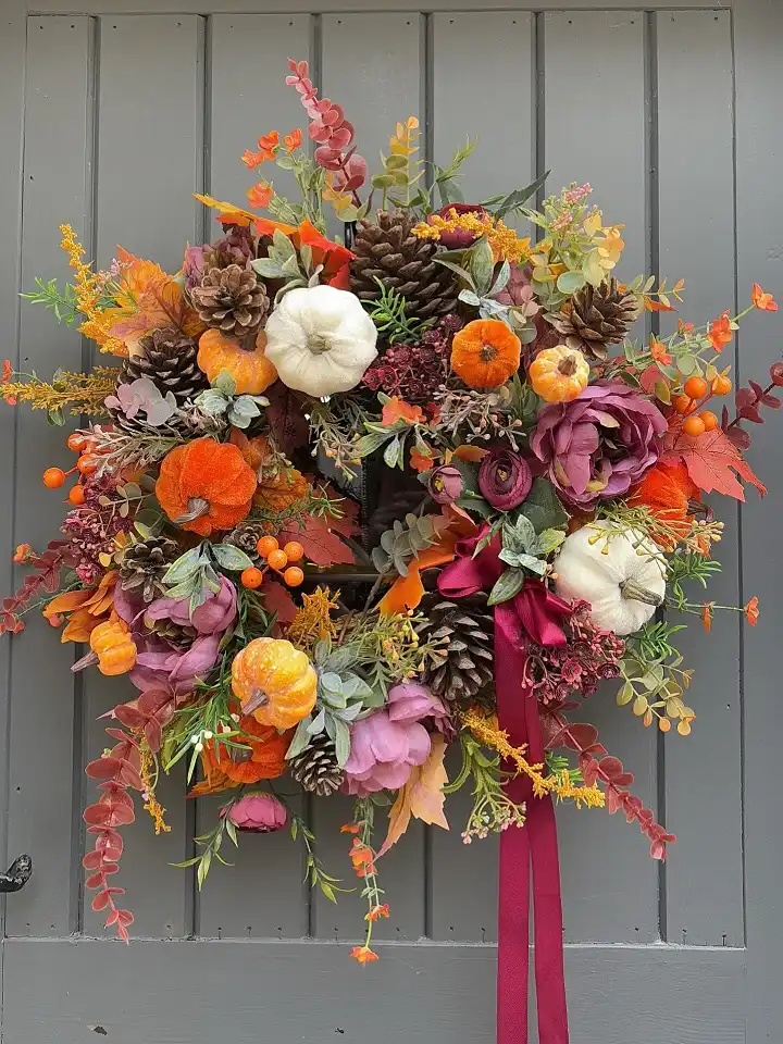
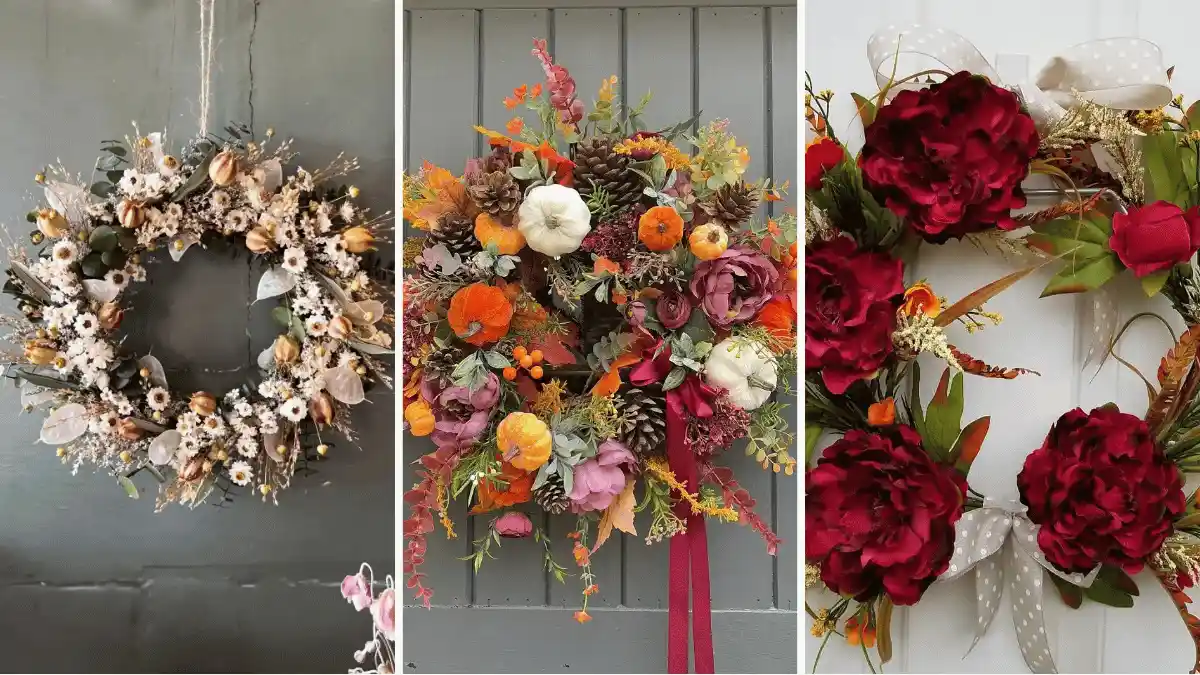
This is not a wreath with a theme so much as a wreath with everything. White pumpkins sit next to orange velvet ones, pinecones cluster in threes, and deep burgundy peonies mix with mustard florets and dried eucalyptus.
A long wine colored ribbon trails from the bottom like a sash. It should feel busy, and somehow it does not, because the color story stays inside warm oranges, burgundies, and dusty purples the whole way around.
A few reasons this holds together instead of looking cluttered:
- Repeating the same 3 to 4 colors across dozens of elements keeps chaos from turning into a mess
- Different pumpkin sizes and finishes, velvet, painted, matte, add texture variety without adding new colors
- Pinecones and eucalyptus give the eye a rest between all the florals
- One long ribbon tail becomes the visual anchor that pulls the whole shape downward
5. A Wreath With Two Distinct Halves in One Ring
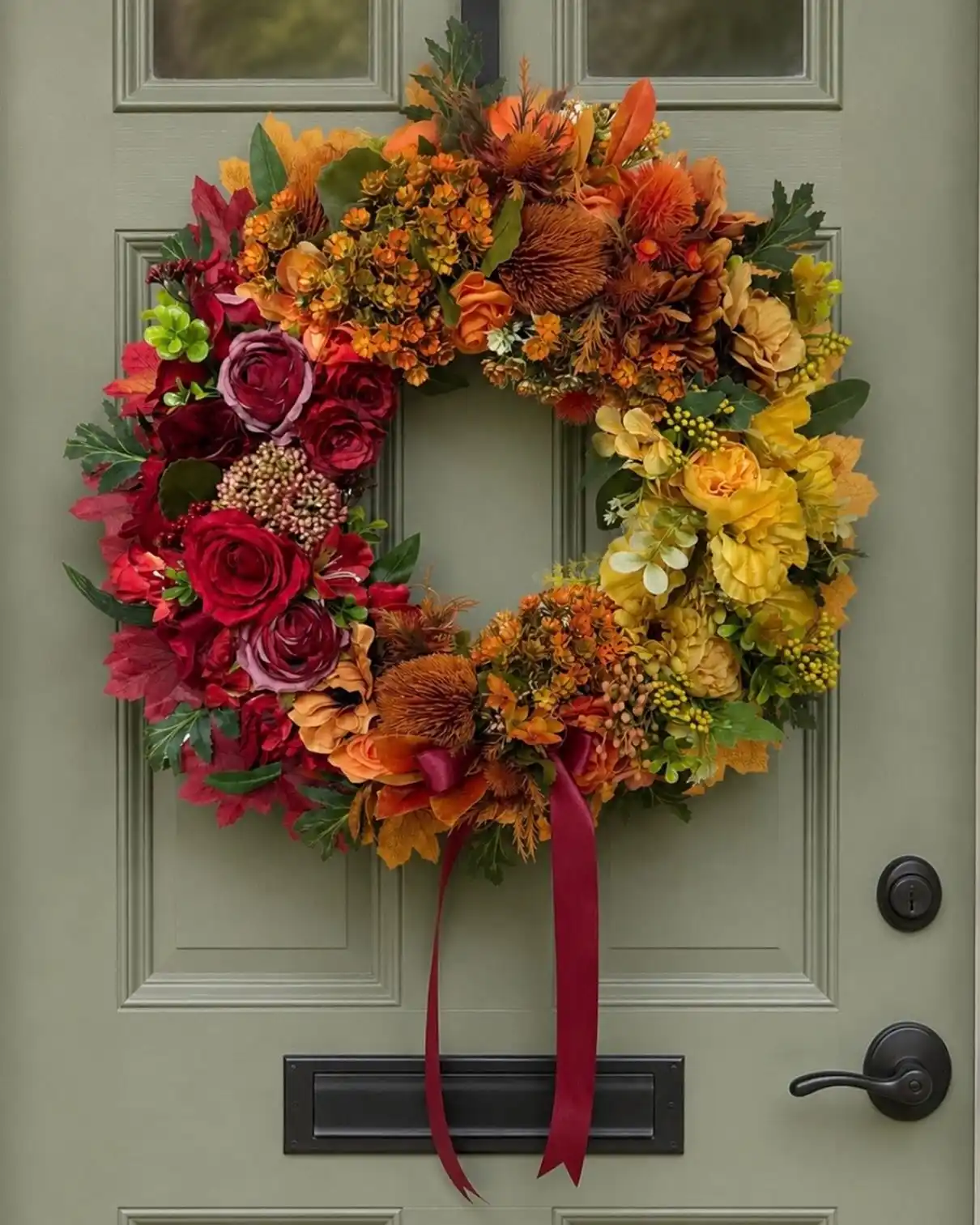
Half rose and red, half gold and citrus. Instead of blending every color evenly around the ring, this one splits into two clear zones: deep burgundy and crimson roses cluster on one side, warm mustard and butter yellow blooms take over the other, with a middle zone of rust and orange where the two color stories meet. A long wine ribbon drops from the bottom, echoing the darker half.
Splitting a wreath into halves like this instead of scattering colors evenly gives it more visual interest up close, and it photographs well from either angle depending on which side faces the camera.
| Rose and red side | Gold and yellow side |
|---|---|
| Deep burgundy roses, crimson blooms. | Mustard mums, butter yellow ranunculus. |
| Reads more moody and formal. | Reads brighter and more welcoming. |
| Pairs well with a darker door. | Pairs well with a lighter door. |
6. Four Oversized Peonies Instead of a Full Ring of Small Flowers
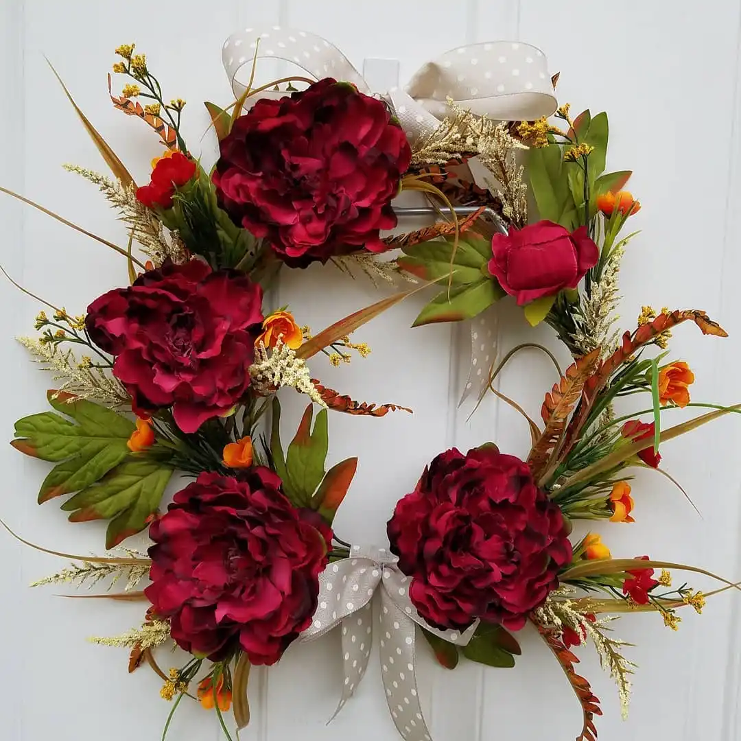
Most wreaths pack in a dozen small blooms. This one uses just four large burgundy peonies, spaced evenly around the ring with room to breathe between each one.
Wispy dried grasses, feathery plumes, and a few small orange accents fill the gaps without crowding the big flowers, and two cream polka dot bows anchor the top and bottom.
Subscribe to DIY Craft Bloom
Get updates on the latest posts and more from DIY Craft Bloom straight to your inbox.
Going big on flower size instead of flower count changes the whole feel of a wreath.
If your peonies, real or faux, are already large, resist the urge to add more. Four well spaced blooms read as intentional. Ten crammed together reads as busy.
7. An All Dried Wreath in Cream, Blush, and Honey Tones
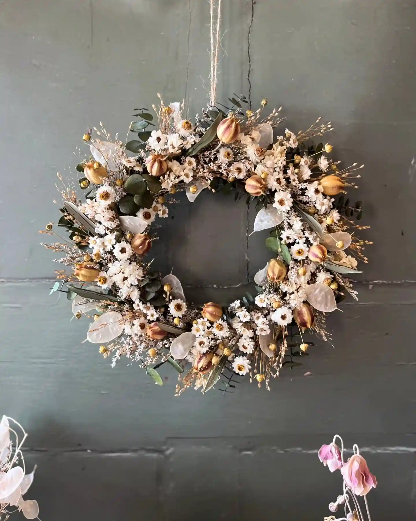
No fresh greenery here, and no bright fall colors either. Small white strawflowers and daisy-like blooms cover most of the ring, mixed with dusty rose seed pods, dried eucalyptus in soft sage, and papery honey colored pods that look almost like tiny lanterns.
Everything has that slightly faded, sun bleached quality that only comes from air drying.
Dried wreaths photograph beautifully but they ask for a different kind of care than faux ones.
They shed over time, especially outdoors in wind or rain, so this style works best hung somewhere sheltered, like a covered porch or an interior door, rather than a fully exposed entrance.
The muted palette here means this wreath skips the usual orange and red fall cues entirely and leans into texture instead.
It reads more like a year round piece with a seasonal edge than a wreath that screams October.
8. A Moody, Eucalyptus Heavy Wreath With Dried Orange Slices
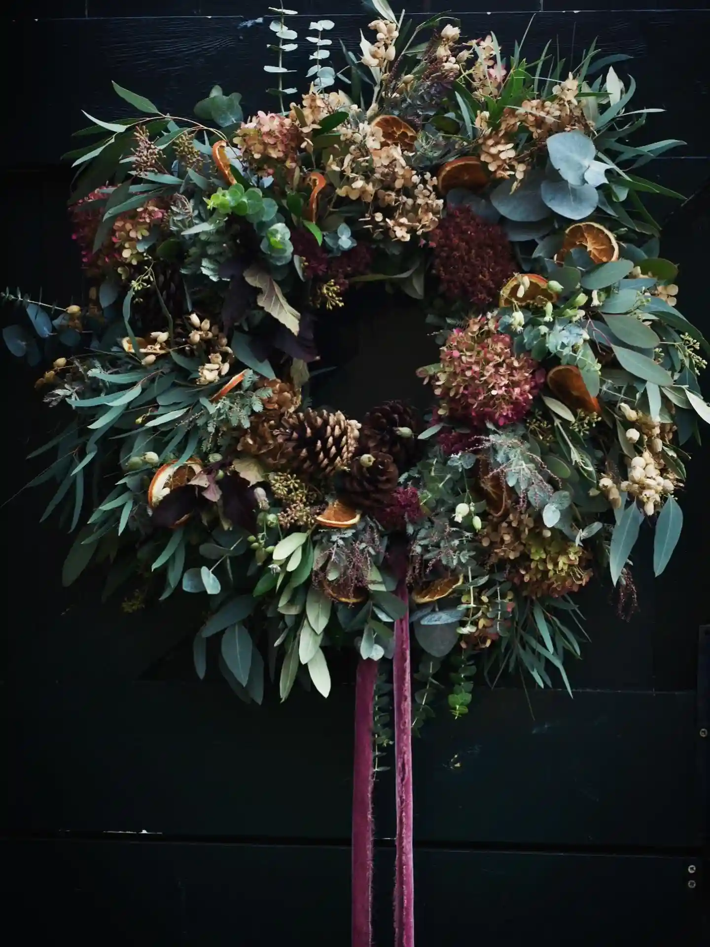
Eucalyptus in sage and silvery blue takes up most of the real estate here, more than any other single element in the wreath.
Dried orange slices are tucked in throughout, their rust color standing out against all that cool green.
Two dark pinecones sit low near the bottom, and small clusters of faded pink hydrangea and burgundy blooms add just enough warmth without turning the whole thing bright. A long velvet ribbon in deep wine hangs down past the wreath itself.
This one photographs almost moody against a dark door, which is clearly intentional given the backdrop it’s shown on.
The eucalyptus gives it a scent element too, since dried eucalyptus holds its fragrance far longer than most greenery.
Leading with greenery instead of flowers lets the dried orange slices and pinecones read as accents, not clutter.
9. A Wreath in Dusty, Antique Tones With Metallic Accents
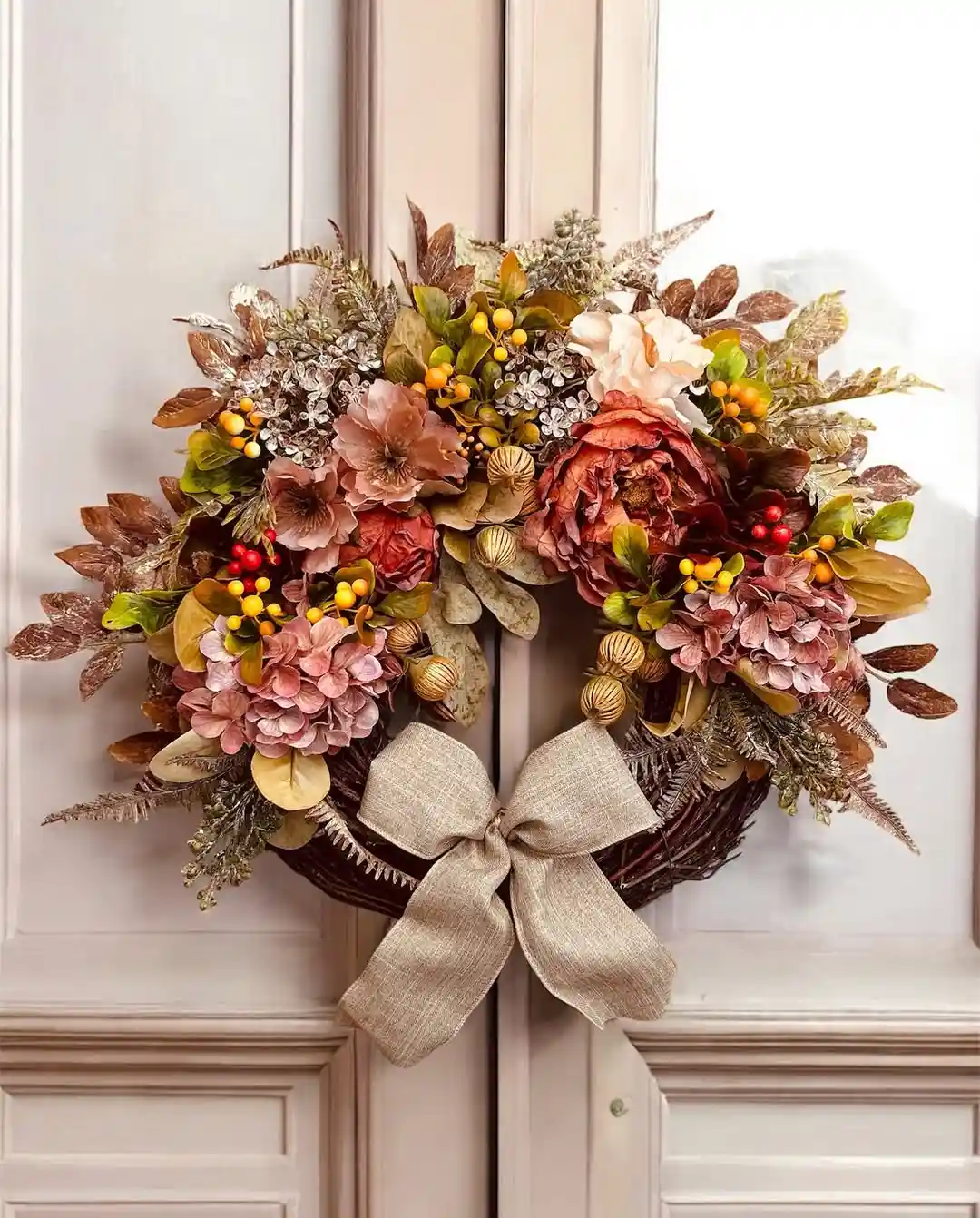
Pink hydrangea, rust colored peonies, and small gold berries share space with silvery, frosted greenery that catches light almost like foil.
Nothing here is a true fall orange or red. Instead the palette sits somewhere between dried rose and champagne, which gives it a softer, more formal look than a typical harvest wreath. A wide burlap bow in warm tan ties it together at the bottom.
The gold ball ornaments tucked among the flowers are an easy detail to miss at first glance, but they add a subtle shine that plain berries would not.
- Frosted, silvery greenery instead of bright green
- Rust and dusty pink florals rather than orange and red
- A neutral burlap bow that does not compete with the metallic accents
Look for stems labeled champagne, dusty rose, or antique gold rather than standard fall colors to get this quieter, muted look.
10. A Twig Base Wreath With a Painted Welcome Sign Built In
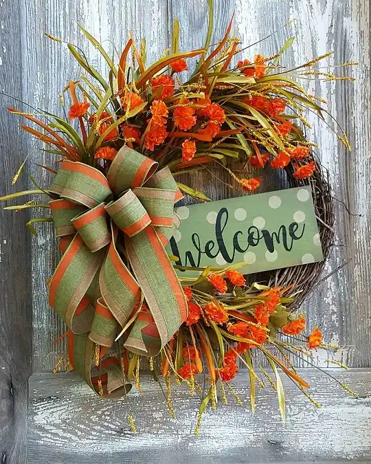
Grapevine and twig show through in the gaps here instead of getting fully covered, which keeps the whole thing from feeling heavy.
Loose sprays of orange florals and wispy grass-like stems sit mostly on one side, leaving room for a small polka dot welcome sign tucked into the base.
A layered green and orange bow anchors the corner where the sign and the florals meet.
Building a sign directly into a wreath instead of hanging one separately takes some planning, but it reads as more intentional than a bolt-on addition.
Practical wreaths with a functional element like this come with a few things worth getting right and a few worth skipping.
- Keep the sign text short enough to read from the street, one word works better than a phrase
- Balance the florals to one side so the sign has clear space instead of getting crowded
- Skip a busy multi pattern ribbon if the sign already has a pattern, since two patterns compete
- Skip covering the whole twig base, since some exposed vine gives it texture
Keep sign text to one short word.
Balance florals to one side of the sign.
A busy patterned ribbon on a patterned sign.
Covering every inch of the twig base.
11. Blue Hydrangea Instead of the Usual Orange and Red
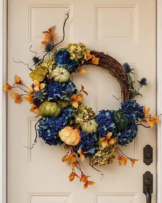
Curly willow branches spiral out from a loose grapevine base, and the color choice breaks the fall wreath rulebook entirely.
Deep blue and sage green hydrangea take over most of the ring, with small white and green pumpkins tucked between the blooms.
Subscribe to DIY Craft Bloom
Get updates on the latest posts and more from DIY Craft Bloom straight to your inbox.
Wispy orange florals and a few blue thistle pods are the only nod to a traditional palette, and they read more as accents than as the main event.
If you already default to orange and red every October, this is worth trying as a change of pace.
- Start with a grapevine wreath base and let a few branches curl outward unclipped for movement
- Cluster blue and green hydrangea heads together instead of scattering them evenly
- Tuck in two or three small pumpkins in cream or sage rather than orange
- Add sparse orange florals only where the eye needs a small break from the cool tones
Use grapevine and let a few branches curl outward unclipped for movement.
Group blue and green heads together instead of spacing them evenly around the ring.
Choose cream or sage over orange so they blend instead of standing out.
Use sparse orange florals only where the cool tones need a break.
12. A Foraged Style Wreath Built From Hops, Rosehips, and Boxwood
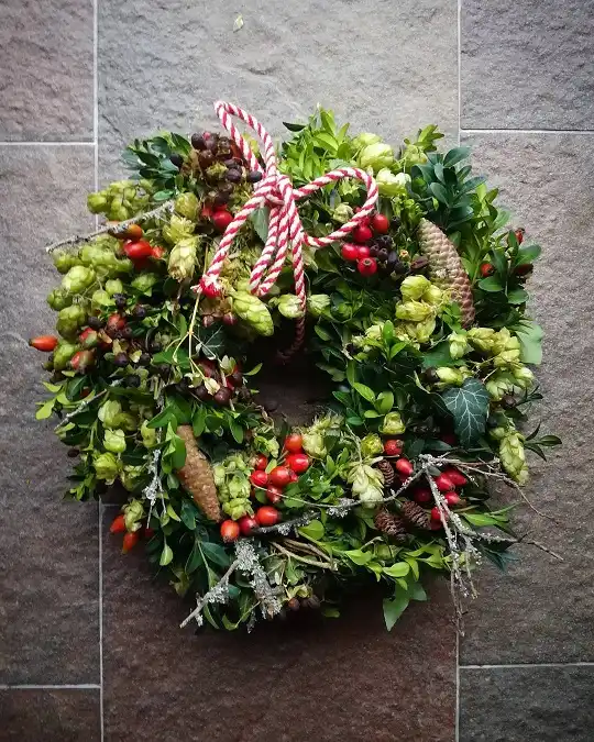
No mums, no faux pumpkins, nothing that looks store bought here. Trailing hop vines curl loosely through dense boxwood, small red rosehips scatter throughout, and a few frosted pinecones peek out near the bottom.
A red and white twisted cord bow, tied loose and a little uneven on purpose, sits at the top instead of a fuller ribbon bow.
This style leans into a wild, just gathered look rather than a polished arrangement, which makes it a good option if you actually forage or grow some of your own greenery.
13. An All Brown and Rust Wreath With No Green Anywhere
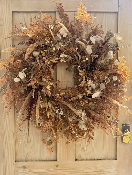
Ferns gone bronze, pampas-style plumes, and papery honesty pods make up this one, all sitting somewhere between tan, rust, and deep brown. Not a single leaf here still reads as green.
Against a natural wood door, it almost blends in at first glance before the texture pulls your eye in.
Skipping green entirely is a bigger design choice than it sounds like.
- Dried ferns in rust and copper tones instead of preserved green ones
- Feathery plume stems add height and movement without adding more flowers
- Papery lunaria pods scattered through give a translucent, almost silvery contrast against all the warm brown
- A dense, layered build means the wreath still reads as full despite the muted palette
This style works especially well against a wood tone door, since the wreath and the backdrop share the same warm family of colors instead of competing.
14. A Wreath With One Oversized Pumpkin as the Focal Point
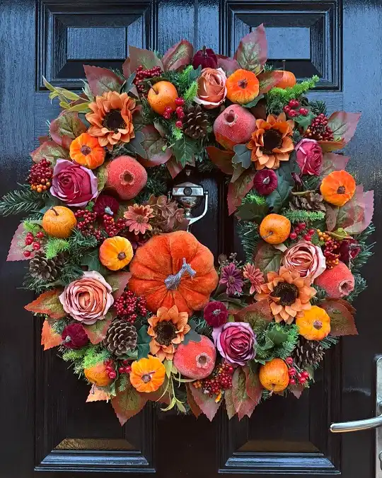
Everything else here supports one large orange pumpkin sitting slightly off-center rather than competing with it.
Burgundy and blush roses, small sunflowers, faux pomegranates, and pinecones fill in around it, all in a deep autumn palette that reads warm even against a dark navy door. Berries and small mums scatter through the gaps so no section feels empty.
Building around one oversized element instead of many medium ones gives a wreath a clear focal point instead of an even, all over pattern.
- The large pumpkin anchors the eye before anything else gets noticed
- Faux pomegranates add a fruit element that most fall wreaths skip in favor of just pumpkins and gourds
- Small sunflowers tucked in break up the roses so the wreath does not read as only one flower type
- A dark door background makes every warm color in the wreath stand out more than it would on a lighter door
This layout suits a front door that could use one strong, obvious feature rather than a wreath that looks good from far away but has no single point to land on.
15. A Multicolor Wildflower Wreath With Two Ribbon Colors Instead of One
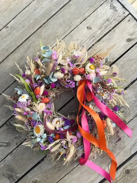
Purple statice, white strawflowers, dusty pink, and touches of coral orange all sit together here, more like a cut flower bouquet than a typical seasonal wreath.
Pampas grass plumes and eucalyptus fill in the structure, and instead of one ribbon color, two trailing streamers in hot pink and orange hang loose from the side.
Most fall wreaths stick to one ribbon color for a reason, but this one breaks that rule on purpose and it still works because the ribbon colors pull directly from tones already present in the flowers.
Laid flat on a wood surface rather than photographed hanging, this one also proves a wreath does not need to be shown on a door to sell the idea.
A styled flat lay works just as well for showing off the texture and color mix up close.
If you use two ribbon colors, pull both directly from flowers already in the wreath.
16. A Green and Purple Textural Wreath With No Orange in Sight
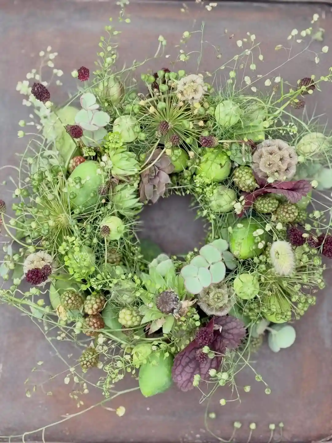
Green apples, unripe blackberries, scabiosa pods, and eucalyptus make up nearly the entire wreath here, with just a few deep plum leaves breaking up all that green.
It looks almost like a still life photographed from above rather than a wreath meant to hang.
Nothing here is dried or faded either, everything reads fresh and slightly unripe, which is its own kind of fall reference since October is still technically harvest season before things turn brown.
This is about as far from a traditional fall wreath as this list gets, which makes it worth including for anyone tired of the same orange and red rotation.
| Traditional fall wreath | This green textural wreath |
|---|---|
| Orange, red, and gold color story. | Green, sage, and plum tones. |
| Dried or faux fall foliage. | Fresh looking green apples and berries. |
| Reads as harvest and cozy. | Reads as modern and botanical. |
Conclusion
Sixteen very different directions, and still only a fraction of what a wreath can actually do once you stop reaching for the same orange and gold combo out of habit.
Whether you gravitate toward the dense maximalist florals, the quiet dried textures, or a full color swap into blue and green, the real takeaway is the same across every entry here: a wreath works best when it commits to one clear idea instead of trying to cover every fall cliché at once.
Pick the version that matches your door, your effort level, and the mood you actually want walking up to your house this season, and save this for the next time you want fresh ideas.