18 Front Porch Planter Ideas That Feel Like a Beach Vacation

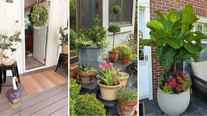
A front porch planter can change the whole feel of a house before anyone even reaches the door, and the eighteen ideas above prove there is no single right way to do it.
Some lean on one dramatic tree in a single oversized pot, others build height with matching urns, stack containers up a wall, or lift ordinary pots onto stools for a few extra inches of impact.
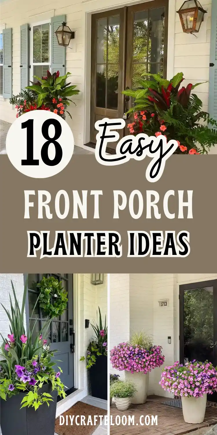
What they all share is intention: a color palette that stays under control, a container that matches the scale of the house, and plants chosen to work together instead of competing for attention.
Whether your entry is wide and formal or narrow and tucked between two windows, there’s a front porch planter idea here that fits.
Terracotta collections work for a porch built one season at a time. Bold color pots work when the architecture is calm and needs a lift.
Tall foliage works when a corner needs height without eating floor space. Pick the one that matches your own entrance, and borrow the layering formula, the height trick, or the color rule that made it work.
18 Front Porch Planter Ideas
1. Matching White Urns With Tropical Color for a Grand Entrance
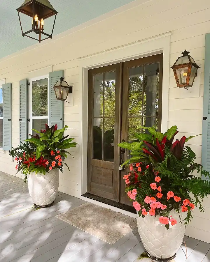
Symmetry is doing a lot of the work here. Two nearly identical white textured urns sit on either side of these glass French doors, and that repetition alone makes the entrance feel finished, even before you look at what’s planted in them.
The plant choice is the other half of the trick:
- Dark burgundy ti plant or cordyline for height and drama
- A ruffle of ferns to fill in the middle
- Coral and pink impatiens spilling over the rim to soften the edges
The pale blue-gray shutters and cream siding stay quiet, so the deep red foliage and bright coral blooms are the only real pop of color on the whole porch. That contrast is why it reads as lush instead of busy.
If your entry has any kind of symmetry (two porch posts, a double door, matching windows), this is the easiest formula to steal.
One matching pair of large urns will do more for curb appeal than five random pots scattered around.
2. Tall Black Planters That Let Purple Blooms Do the Talking
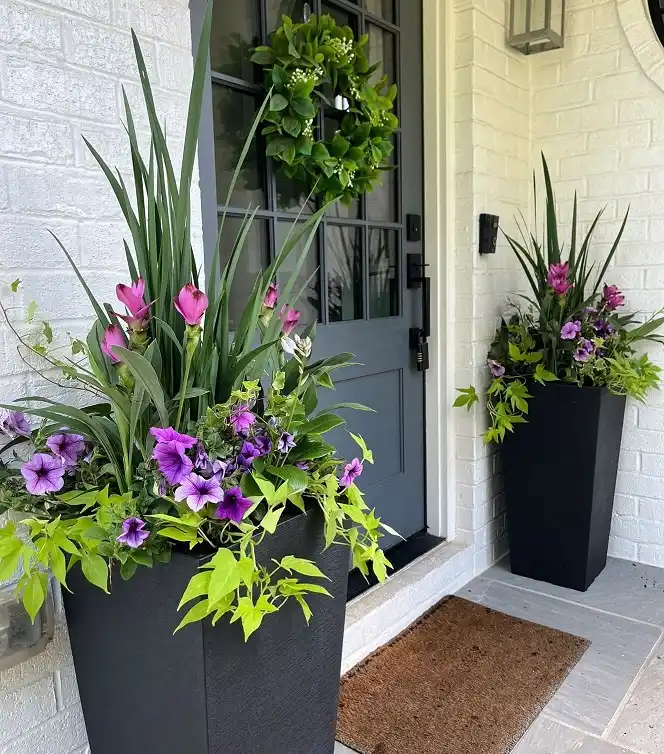
Matte black tapered planters against white painted brick is a strong combo on its own, but what makes this pair work is the height built into the arrangement itself.
Spiky grass-like foliage shoots straight up before anything else gets a chance to bloom, so your eye travels up the door before it ever lands on the flowers.
Here’s how the layering happens, bottom to top:
- Start with a thriller. Something upright and blade-shaped, like canna or a tall ornamental grass, goes in first for height and structure.
- Fill with a filler. Deep purple lily-type blooms and ruffled petunias pack in around the base for color.
- Let a spiller take over the edges. Chartreuse sweet potato vine trails over the rim and softens the sharp lines of the black container.
The dark planter is doing quiet work here too. Black recedes visually, so the purple and lime green get to be the star instead of competing with the pot for attention.
Tall, upright, blade-shaped foliage in the back or center for instant height.
Bold blooms in one or two colors around the middle for the main show.
A vine that drapes over the edge to soften the container’s hard lines.
3. Overflowing Petunia Mounds That Hide the Pot Completely
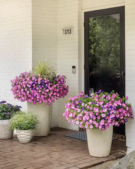
The house number is the only thing on this porch you can actually read from the street.
Everything else disappears under a solid wave of pink and purple petunias planted so densely that the tall cream urns barely peek through at the bottom.
This look comes down to one choice: planting a single flower type in bulk instead of mixing several.
A few wispy blades of ornamental grass poke up in the back planter for a hint of texture, but otherwise it’s petunias from rim to rim, spilling so far over the edge that the container looks like it’s floating on flowers.
The smaller pots off to the side, one with purple blooms and one with a soft mounding green plant, echo the same color story without competing for attention.
One flower, planted heavy, reads as lush. Five flowers, planted thin, reads as scattered.
4. Classic Fern Urns for a Porch That Skips Flowers Entirely
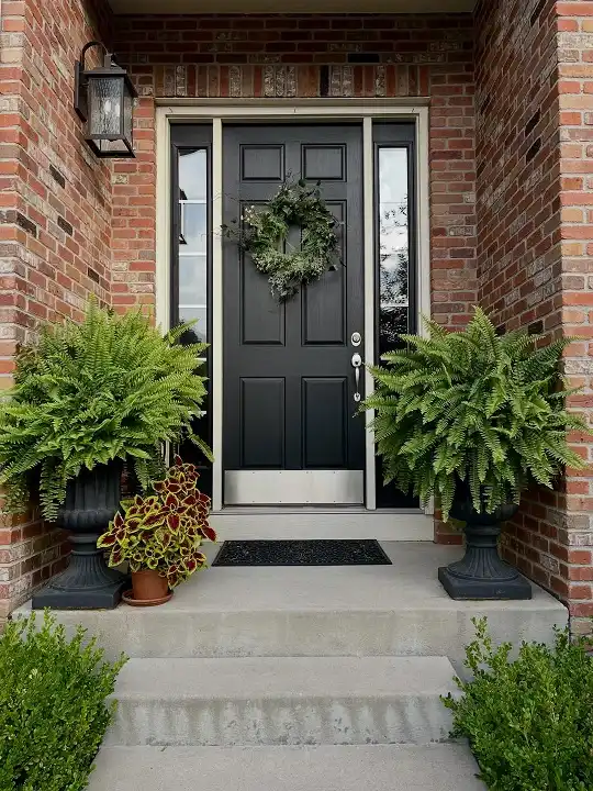
No blooms anywhere in this arrangement, and it still looks finished. Two black urn-style planters, the kind with a fluted pedestal base, hold nothing but full Boston ferns on either side of the black door.
Against all that warm brick, the cool green fronds are the only softness on an otherwise hard, angular porch.
A small terracotta pot with coleus gets tucked in near the left urn almost as an afterthought, its red and yellow leaves giving the only real color note on the whole step.
That’s the move worth copying: if you want visual interest without a flower bed’s worth of upkeep, one foliage plant with colorful leaves can stand in for a whole pot of blooms.
Pick a full, symmetrical fern for each urn so the pair reads as one calm shape.
Add one small colorful foliage plant nearby for contrast, no flowers needed.
Don’t mismatch urn sizes if you want the calm, symmetrical effect.
Subscribe to DIY Craft Bloom
Get updates on the latest posts and more from DIY Craft Bloom straight to your inbox.
Don’t let ferns dry out between waterings, they wilt fast and won’t bounce back the same day.
5. Layering Hanging Baskets With Boxwood for a Cottage Entrance
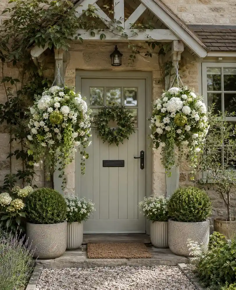
Height happens in three separate zones here instead of just inside a pot. Two lush white hanging baskets swing from the pergola beam, hydrangea and boxwood balls fill the ground-level planters, and a simple greenery wreath sits in the middle at eye level. Nothing is competing because each element owns its own space on the wall.
What’s easy to miss: the flowers are almost entirely white and pale green, so the arrangement never fights with the weathered stone or the sage green door. A cottage look like this leans on restraint more than variety.
- Hanging baskets add volume above eye level without crowding the porch floor
- Rounded boxwood shapes in stone urns give the whole scene a tidy, clipped anchor
- White blooms tucked around the boxwood soften the formal shape without breaking the palette
Fill the upper porch space without adding floor clutter.
Give the ground level a tidy, structured anchor year round.
Keeps stone, door, and greenery working together, not against each other.
6. Bright Yellow Pots That Turn Bold Color Into the Whole Design
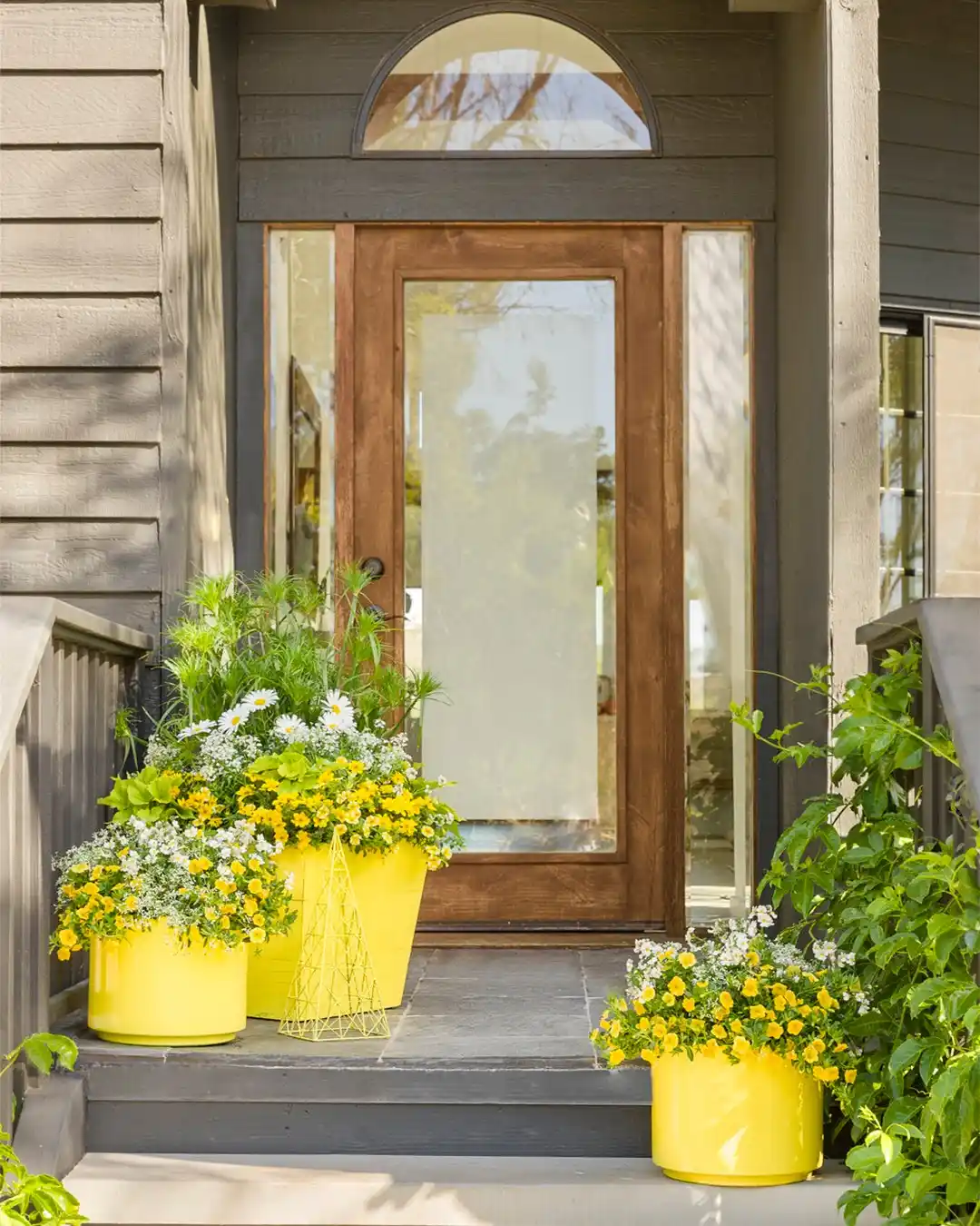
Three glossy yellow planters do something the flowers alone couldn’t: they turn a mostly gray and wood-toned porch into something cheerful from the sidewalk.
The blooms inside lean yellow and white too, daisies, calibrachoa, and a few feathery green fronds for texture, so the pot and the plants read as one continuous color instead of two separate decisions.
A tall wire cone tucked between two of the pots adds a bit of playful structure without needing another plant.
It’s a small detail, but it breaks up what would otherwise be three same-height mounds sitting in a row.
7. Raising Planters on Stools for Instant Height Without Bigger Pots
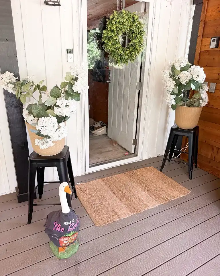
Two black metal stools do the real work in this setup. Instead of buying taller planters, this porch just lifts two ordinary tan woven pots off the ground, and that alone gets the white hydrangea blooms up near eye level where a doormat scene actually needs some visual weight.
It’s a cheap trick that works almost anywhere:
- A stool or plant stand costs less than a large matching planter pair
- Lifting a pot changes its proportion without repotting anything
- The extra height balances a tall glass door instead of getting lost at the bottom of it
The boxwood wreath on the door and the woven doormat keep the palette calm, and a whimsical goose figure near the mat adds the kind of personal touch that makes a porch feel lived in rather than staged for a magazine.
8. Grouping Mismatched Terracotta Pots by Height, Not by Matching
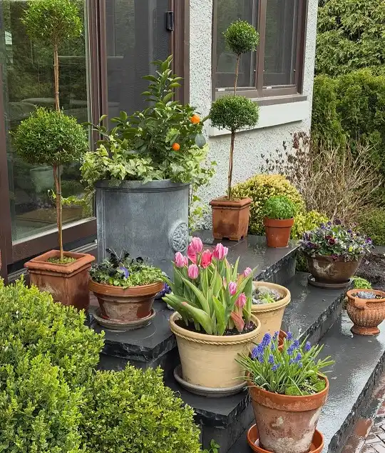
Nothing in this collection matches, and that’s exactly the point. A galvanized metal citrus planter sits next to aged terracotta, next to a stone-look urn, next to a topiary in a square wood box, and somehow it all reads as one intentional grouping instead of a yard sale.
The trick is grouping by height and texture instead of by container style. Two clipped topiary trees anchor the back corners at the same tall height, the citrus tree in its zinc tub sits at medium height in the middle, and everything low, the tulips, grape hyacinth, violas, and small evergreens, clusters along the front step.
Your eye reads the whole arrangement as one shape even though no two pots are alike.
Worth stealing for anyone building a container collection slowly over a few seasons instead of buying a matching set all at once.
9. One Statement Tree Standing In for a Whole Garden
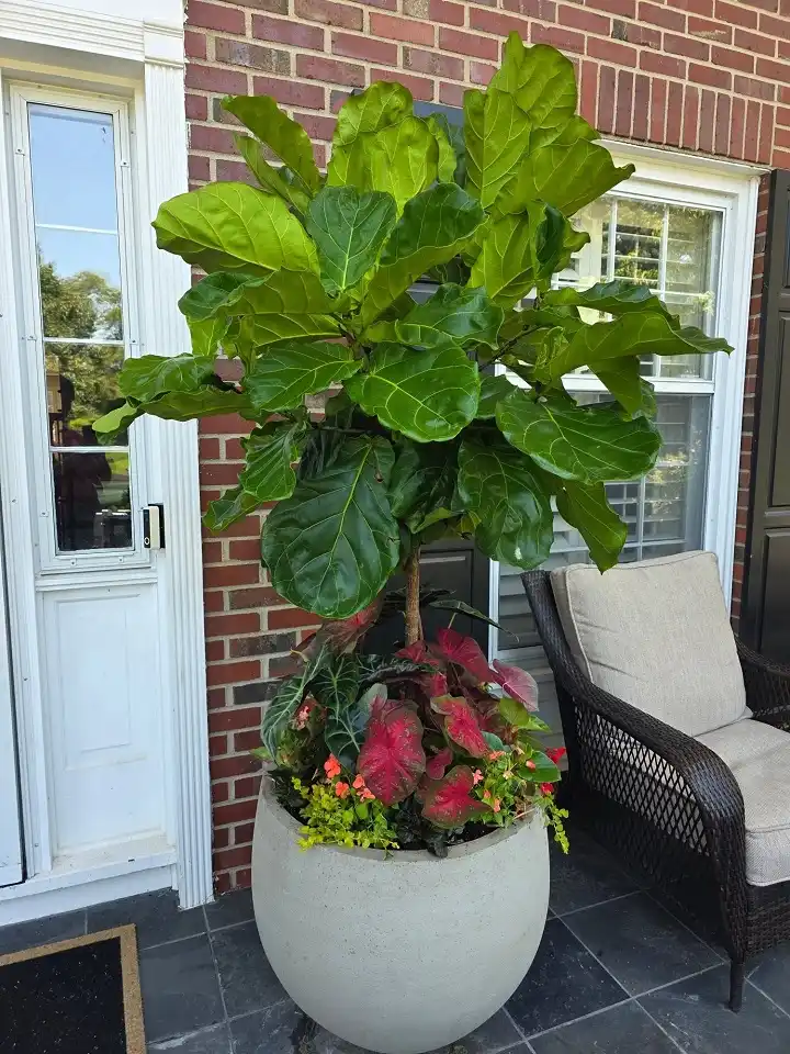
A fiddle leaf fig planted straight into an oversized bowl-shaped planter does more for this corner than a dozen small pots ever could.
The giant paddle-shaped leaves reach well above head height, so the eye goes there first, before it ever notices the brick wall or the wicker chair beside it.
Down at soil level, the container isn’t wasted space either. Caladiums in hot pink and burgundy, a few sprigs of orange begonia, and a trailing yellow-green vine fill the base of the pot in a tight, layered ring around the trunk.
That’s really the whole formula:
- Pick one tree-form plant with bold, oversized foliage as the single focal point.
- Underplant the base with two or three low, colorful companions so the pot doesn’t look empty at eye level.
- Choose one large, simple container instead of several, so nothing distracts from the tree’s shape.
A single big planter like this also solves a real space problem. It gives a narrow corner serious visual height without eating up floor room the way a cluster of pots would.
One big leaf beats ten small pots for making a corner feel finished.
10. Turning a Terracotta Collection Into Steps of Its Own
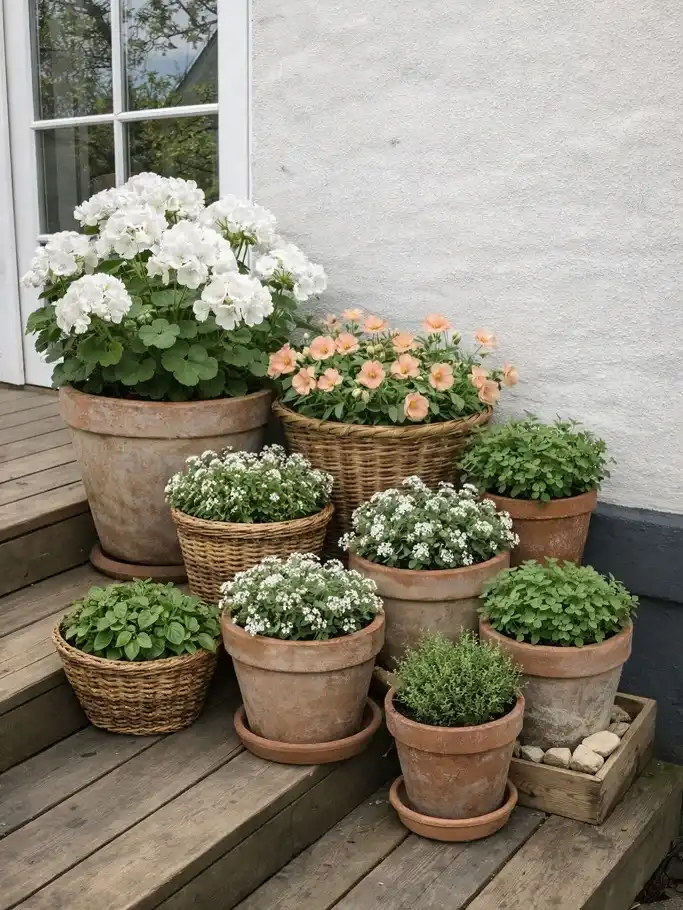
Nine small pots, no giant containers anywhere, and the whole cluster still reads as one arrangement because it’s built to follow the stair steps themselves.
White geraniums claim the tallest terracotta pot on the top step, a woven basket of peach petunias sits just below it, and everything smaller, alyssum, thyme, and a few leafy herbs, tucks into the gaps lower down.
Mixing materials matters here too. Aged terracotta pots sit right next to woven baskets, and the mismatched textures actually help the grouping feel collected over time rather than bought in one trip to the garden center.
Group your tallest pots on the highest step and let smaller pots step down with the stairs, that alone will make a random collection look planned.
11. Ferns and Caladiums Softening a Pair of Classic Urn Planters
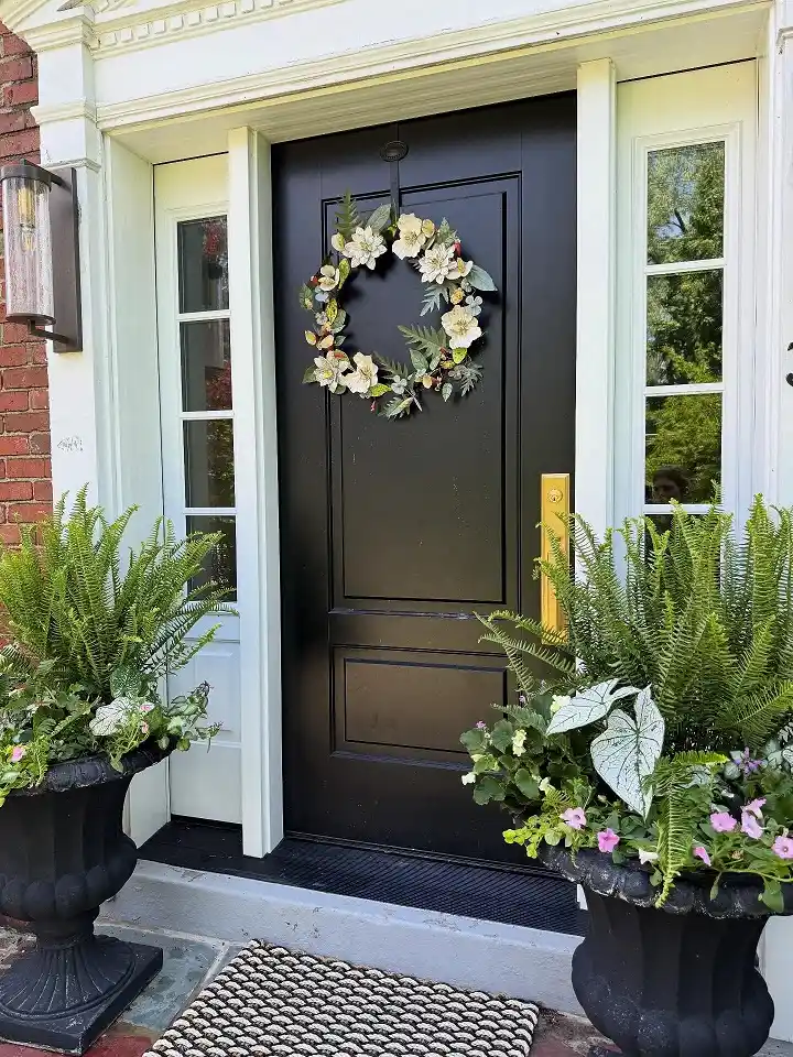
A black door this dark needs pots with some real presence, and these fluted black urns match that weight without competing with it.
Boston ferns spill out the top of both, but the pot on the right goes a step further, layering in white and green caladium leaves and a few trailing petunias for a texture the left urn doesn’t have, which is a smart way to keep a matching pair from looking too identical.
The brass door handle picks up a warm gold note that echoes the classic, formal shape of the urns themselves.
It’s a small detail, but it ties the hardware and the planters together without anyone planning it that way.
Subscribe to DIY Craft Bloom
Get updates on the latest posts and more from DIY Craft Bloom straight to your inbox.
12. Blue Hydrangeas and Ferns in Matching Navy Square Planters
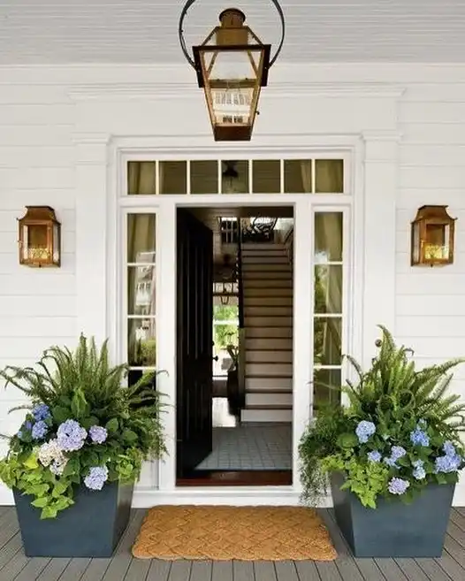
Navy blue square planters are an easy way to add color without touching the flowers at all.
Here they sit under a pair of brass lantern sconces, holding the exact same recipe on each side: full ferns for height and movement, blue and white hydrangea blooms tucked in below for the color payoff.
What ties the whole entry together is restraint. White siding, white trim, brass lanterns, navy pots, blue hydrangeas, that’s the entire palette, no more than four tones total.
A woven doormat in warm tan is the only material that breaks from blue and white, and it works because it’s grounded low on the porch floor instead of competing at eye level.
13. Stacking Planters Vertically for a Rainbow of Zinnias
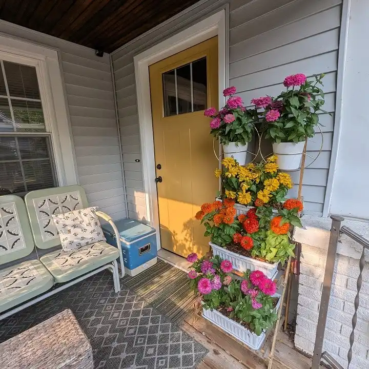
Four tiered white planters climb the wall here instead of spreading across the floor, and each one holds a single zinnia color, hot pink up top, then gold, then orange, then a mixed pink-and-purple tier at the bottom.
That kind of color blocking, one hue per level, is what makes a rainbow bouquet look designed instead of chaotic.
This setup is really solving a space problem. A narrow strip of porch next to a mustard yellow door doesn’t have room for wide pots, so stacking vertically lets a small footprint hold as much bloom as a full flower bed would.
14. Banana Leaf Foliage Giving Two Black Planters Serious Scale
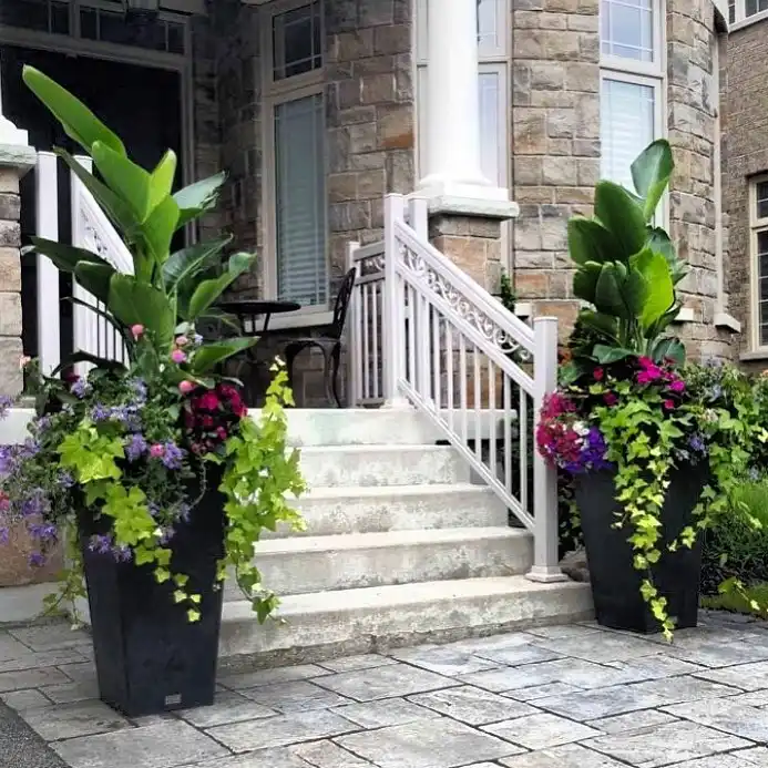
Tall banana plants shoot up nearly to the porch roofline in both of these tapered black planters, flanking a stone staircase in a way that makes the whole entrance feel bigger than it actually is.
The broad paddle leaves are the real showpiece, everything else planted below is there to support that scale, not compete with it.
Underneath the banana leaves, magenta and purple blooms tuck in close to the base, and long chartreuse ivy spills all the way down past the rim of the pot, almost reaching the stone pavers.
That vine is doing important work: it keeps a tall, top-heavy arrangement from looking stiff or lopsided.
15. Pedestal Urn Layered With Boxwood, Vines, and White Blooms
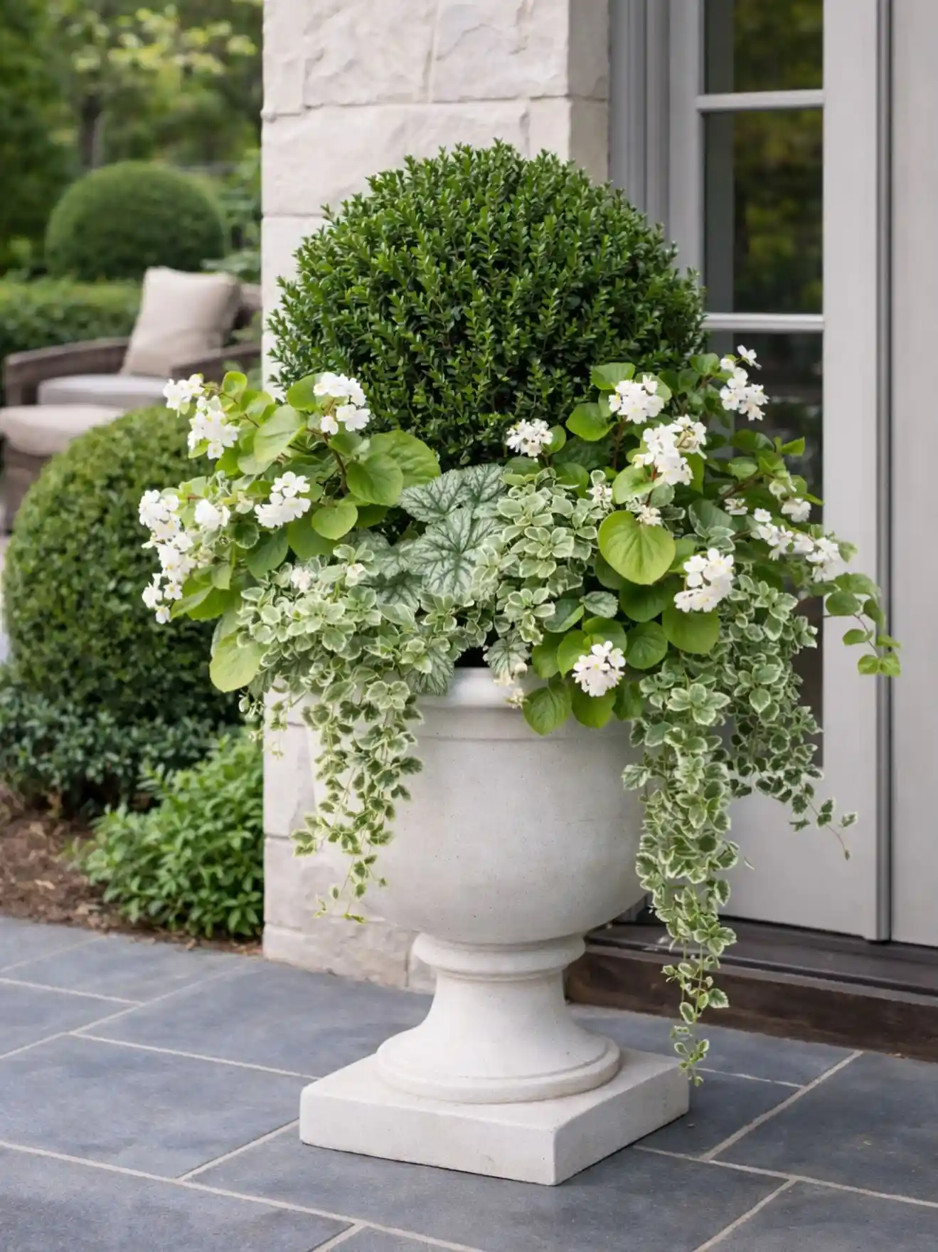
A classic stone pedestal urn gets three distinct layers instead of one big mass of green.
A single clipped boxwood ball sits at the center like a quiet anchor, white star-shaped blooms fan out around the sides for texture, and two different variegated vines spill clear down past the pedestal base, almost reaching the patio stones.
What separates this from a plain green planter is the mix of leaf shapes. Rounded boxwood, soft silvery heuchera leaves, small green climbing foliage, and broad glossy leaves under the white flowers all sit side by side, so even without much color the pot never looks flat or one-note.
16. Olive Topiaries and Warm Stone Urns for Quiet, Elegant Symmetry
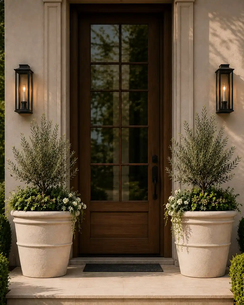
Olive trees rarely show up in porch planters, and that’s exactly why this entrance stands out.
Two soft, silvery topiaries rise from oversized stone-colored urns, their feathery gray-green leaves catching the warm evening light from the lanterns on either side.
Underneath, a low mix of white blooms and trailing greenery fills out the base so the tall trunks never look bare or top heavy.
The whole look leans on warmth rather than bright color. Cream stucco, aged brass sconces, honey-toned wood door, and putty-colored urns all sit in the same tonal family, so the olive foliage reads as the single cool note in an otherwise warm palette.
That restraint is what makes a pair of pots this large feel refined instead of overwhelming.
A single unusual plant, repeated on both sides, reads as designed instead of just decorated.
17. Rust-Toned Bronze Pots Standing In as a Bright Red Accent
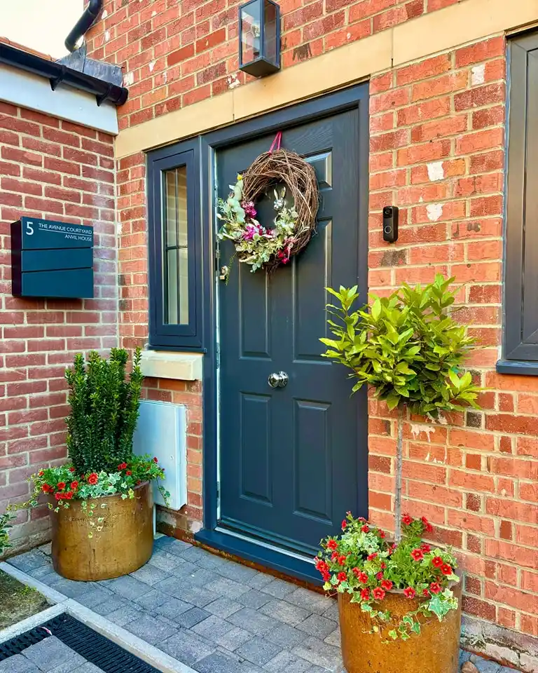
Two aged bronze planters bring an unexpected warmth to this navy door, their weathered copper-brown finish echoing the same red brick surrounding them.
A standard topiary bay tree sits upright in one pot, while the other stays low and full with red geraniums and trailing ivy, an easy way to give a small entrance two different heights without needing two matching trees.
Red flowers against navy and brick could easily clash, but here they don’t, mostly because the metal containers sit right in the middle of that color range, part rust, part brick, part copper. That in-between tone is what keeps the red blooms from looking out of place.
A weathered metal pot works like a bridge color, it can pull two clashing tones like red flowers and a dark door into the same palette.
18. Blue-and-White Ceramic Urns Framing a Dramatic Twig Archway
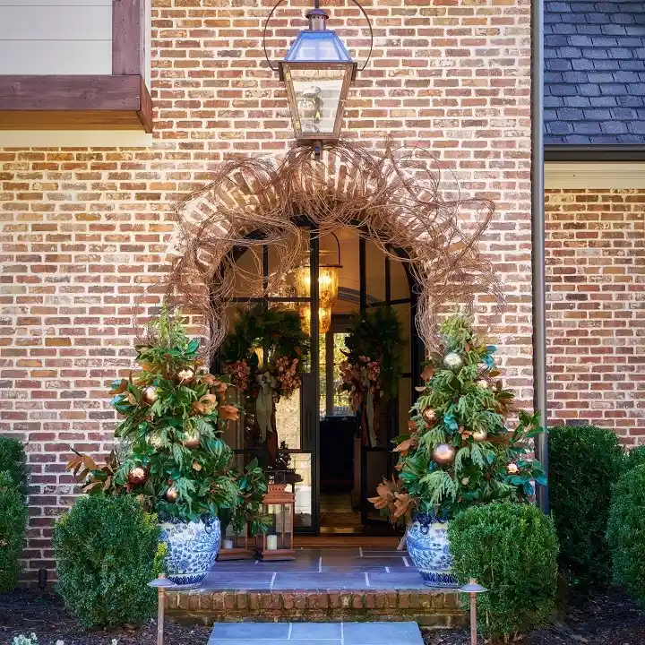
A pair of classic blue-and-white porcelain urns holds the whole design together here, even with a woven twig arch and a lantern pulling focus above the door.
Cone-shaped magnolia and greenery topiaries rise out of each urn, dotted with copper ornaments, and the chinoiserie pattern on the pots ties back to the warm brick in a way plain terracotta never could.
What makes this one worth studying, even outside the holiday styling:
- Pick a patterned urn as the anchor. Blue and white porcelain reads as timeless, not seasonal, so the pots work all year even when what’s inside them changes.
- Shape the greenery into a cone. A tapered topiary form echoes the arch above it, so the whole entrance feels like one continuous shape from lantern to step.
- Let a small styled vignette sit between the urns. A lantern and a low stack of boxes fill the gap at the threshold without needing a third planter.
Blue and white porcelain stays timeless no matter what’s planted inside.
A tapered topiary form echoes an arch or doorway above it.
A lantern or small vignette fills the threshold without adding a third pot.
Conclusion
No two porches need the same fix, and that’s the real takeaway from this list. Some entrances just need one bold container to feel complete, others come together through a matching pair or a whole grouped collection built up over time.
Start small if you’re not sure where to begin: one good pot, planted with real intention, will do more for your entrance than a handful of scattered ones ever could.
Save this for the next time your porch needs a refresh, whether that’s this weekend or next spring.