15 Scrapbook Page Ideas for Beginners You Can Copy This Weekend


Most first scrapbook pages don’t stall because of bad supplies. They stall because a blank page stares back, and nothing feels good enough to glue down first.
That freeze is normal. Every crafter with a shelf full of albums once sat with one photo, a roll of washi tape, and no clue where any of it should go. More stickers won’t fix that. A layout you can follow will.
So this list is all about layouts. You’ll find scrapbook page ideas for beginners in lots of styles: soft vintage journals with torn paper, a bold family title cut from patterned paper, a beach page with clean photo mats, an about me spread, and even a digital page that needs zero supplies.
Some take an hour. A few are slow, cozy projects for a rainy weekend.
Each idea shows what makes the page work, plus simple steps or supply notes so you can make your own version with what you already have. Pick the one that fits the photos sitting in your phone right now, and start there.
What to Know Before You Make Your First Scrapbook Page
A good beginner page has three parts: a background, a focal point, and a few small details that tie it together. Get those right and the page looks planned, even if you made it at the kitchen table in one sitting.
- Choose your photos or story first. Supplies come second. The memory decides the colors and the mood.
- Lay everything out before gluing. Move pieces around for a few minutes, then snap a phone photo of the version you like.
- Stick to two or three main colors. Pull them straight from your photos so the page feels connected.
- Layer from big to small. Background papers go down first, then photos, then stickers and words on top.
- Leave a little empty space. A page that can breathe is easier to look at than one packed edge to edge.
1. Vintage Butterfly Spread Made With Quote Stickers

Soft browns, old handwriting paper, and two butterflies that look like they just landed. This travelers notebook spread has no photos at all, and it still feels full of story.
The quotes do the heavy lifting. Short phrases sit on tags, ovals, and torn scraps across both pages, so your eye keeps finding something new to read. A dried flower sticker in one corner and a small framed butterfly image keep it from turning into a wall of words.
Copy it with one sticker pack in a single color family. Tear the edges of a few papers, overlap them a little, then tuck the quotes on top wherever there’s a gap.
The papers look aged, so nothing has to line up perfectly. Rough edges hide shaky cutting.
Every piece stays in tan, cream, or brown. That is why so many layers still look calm.
One big butterfly sits high on each page. Together they link the spread and pull your eye across the fold.
2. Column Layout for a Simple Outdoor Photo Page
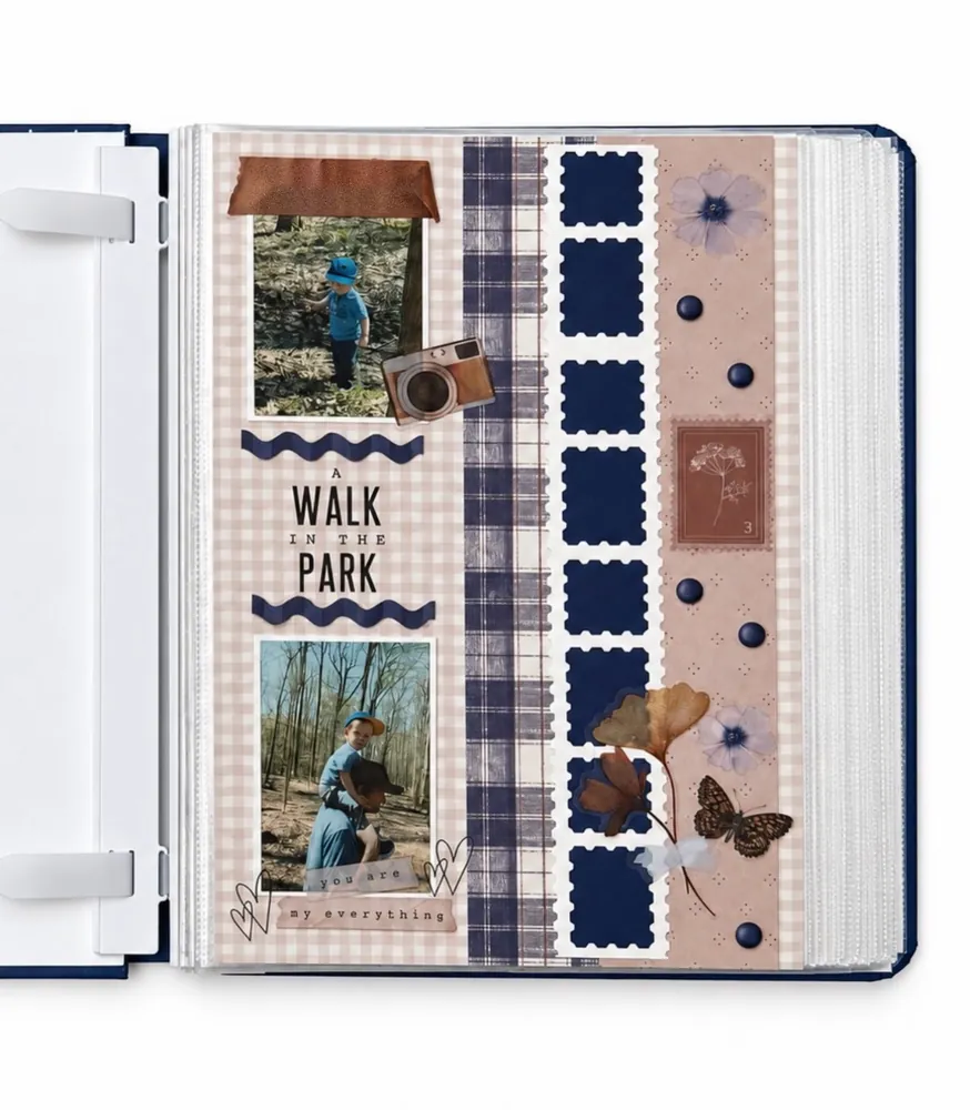
Strips of paper. That’s really all this page is built on, and it’s one of the easiest layouts on the list to copy.
The page is split into tall columns. Pale gingham on the left holds two photos and the title. Next comes a navy plaid strip, a row of navy stamp-shaped squares, and a dusty pink strip with flowers and small round brads. The navy matches the album cover and the little boy’s outfit, so the whole page feels like it belongs together.
Cut three or four patterned papers into long strips, each a different width.
Glue them side by side across the page, with the widest strip where your photos will go.
Place one photo near the top and one near the bottom of the wide strip, with the title in between.
Wavy trim above and below the title is a cheap way to make plain sticker letters look finished.
3. Giant Patterned Letters That Spell Out the Title

When the word is the design, you need far fewer photos. This layout spells FAMILY in huge letters, each cut from a different patterned paper, and slips a single photo into the bottom row.
Here’s what makes it work:
- Every letter uses a new pattern, but they all stay in yellow, orange, pink, and green.
- The paper edges are roughed up, which hides wobbly cutting.
- Small flowers, a rainbow, a stamp sticker, and sequins sit on the letters, not on the background.
- The plain white base stays clean, so the busy letters never fight each other.
Print big block letters on plain paper, flip your patterned sheets over, trace, and cut. Nobody will see the pencil lines.
4. Retro Space Theme With Bold Word Signs
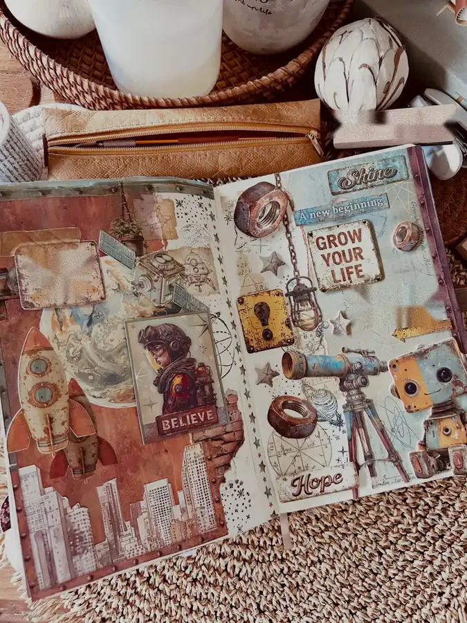
Look closely and you’ll spot a smart split between the two pages.
The left page is all pictures. A rocket, a planet, a girl in a flight helmet, and a city skyline sit on a rusty orange background.
The right page is mostly words. Little signs reading Shine, Grow Your Life, Hope, and A new beginning sit between a robot, a telescope, and a few rusty metal nuts.
Subscribe to DIY Craft Bloom
Get updates on the latest posts and more from DIY Craft Bloom straight to your inbox.
Splitting pictures and words like this makes a busy theme easy to read. Everything also shares the same worn, rusty texture, which turns a pile of random space stickers into one story. Love cars, robots, or the ocean instead? The same plan works for any theme.
5. Travel Memory Spread With Maps and Ticket Stubs
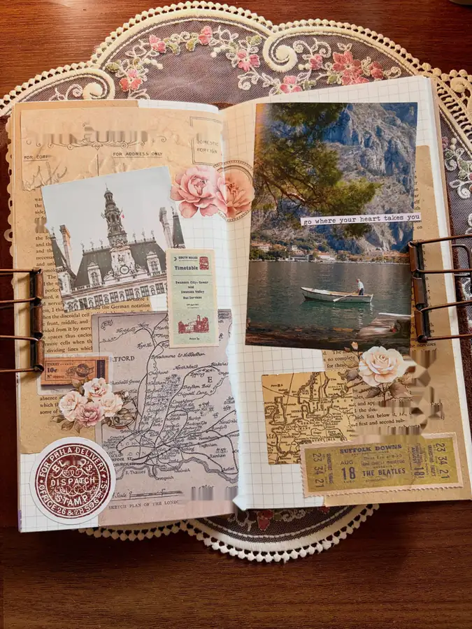
Save the paper bits from your next trip. This spread shows that a bus timetable, an old ticket, and a scrap of map can matter just as much as the photos.
The left page layers a photo of a grand old building over a city map, with a timetable card, a small postage stamp, and a round red seal. The right page gives one big lake photo the spotlight, with a strip of typed text placed right on the picture. Pale pink roses soften all that paper.
A grid notebook keeps the base tidy, and large binder clips hold the pages flat while you work.
6. Book Page Background With a Split Quote
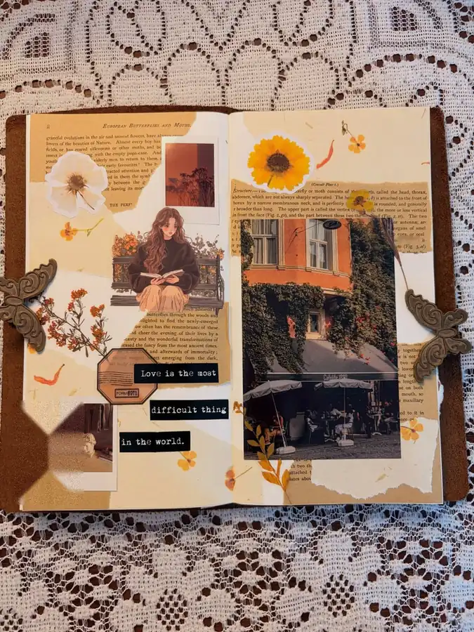
Old book pages make one of the cheapest backgrounds around, and this autumn spread shows how good they look under a few photos.
Torn strips of printed text cover most of both pages. On top sit a small instant photo, a picture of an ivy-covered cafe, a sticker of a girl reading on a bench, and little orange flowers. A sunflower sits at the top of the right page like a tiny sun.
The quote is the clever part. It’s broken into three short black strips stacked down the page, like label-maker tape. Splitting words this way fills empty space and makes people slow down to read every line.
Two metal butterfly clips on the edges are a nice extra. They hold the pages open and look like part of the design.
7. All About Me Page With Fill-In Tags
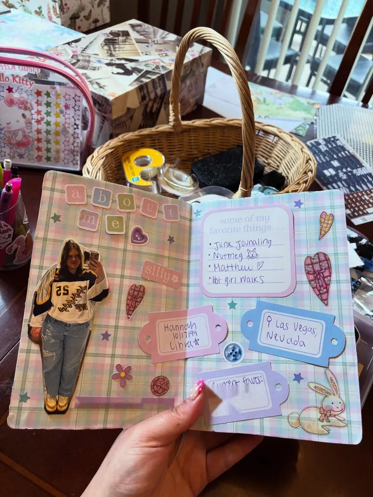
Stuck on what to put in your first album? Start with yourself.
This about me spread uses pastel plaid paper, letter tiles that spell the title, and a full-length photo cut out around the edges so it pops off the page. The right side is mostly tags plus a small card listing favorite things, all filled in by hand.
Fill-in tags take the pressure off. You don’t need a big block of journaling, just a word or two on each tag. Hearts, stars, a button, and a bunny sticker fill the gaps between them.
Make a new one every year. Flipping back later to see what changed is half the fun.
8. Fill My Cup Page With Pull-Out Paper Strips
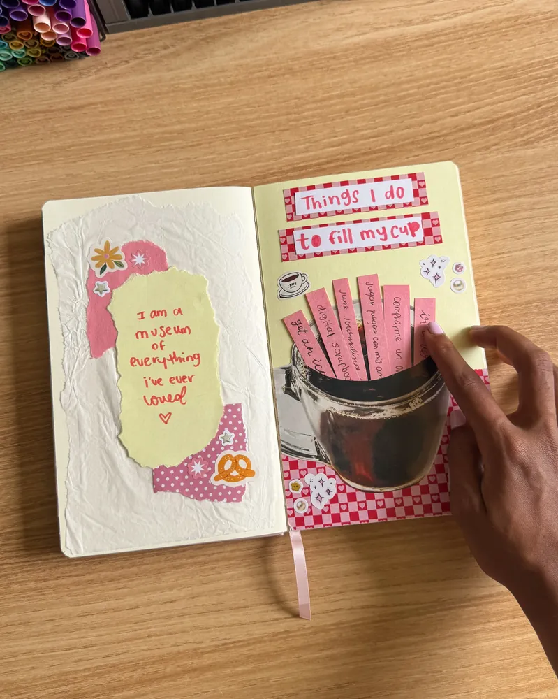
Pages you can touch are more fun to flip through, and this one hides a small surprise.
A big cutout of a glass mug sits on the right page over pink checked paper. Tucked inside the mug are pink paper strips, each one naming something that fills the maker’s cup. The strips slide up so you can read them, like pulling cards from a pocket.
The left page stays calm: crinkled tissue paper, a torn yellow card with a short handwritten line, and a few cute stickers.
To build the pocket, glue only the sides and bottom of the mug cutout. The open top becomes the slot for your strips. Swap in a jar, a bag, or a basket if a mug doesn’t fit your page.
9. Three-Photo Beach Layout With Clean Black Mats
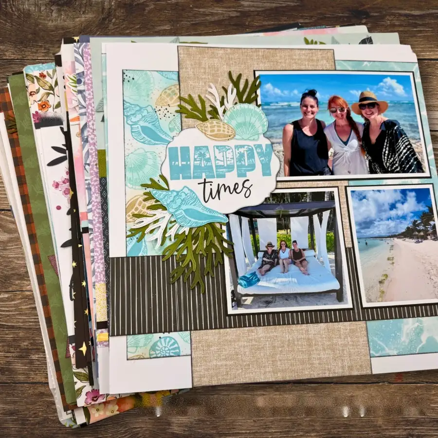
Classic square scrapbook layouts can look tricky, but this beach page runs on a simple grid.
Three vacation photos sit on thin black mats: one wide shot at the top and two smaller ones below. Behind them, the page is split into blocks of seashell paper, a burlap-look paper, and a black striped band running across the middle.
The title lives on a white scalloped label wrapped in die-cut seaweed, coral, and shells. That one cluster is the only decorated spot, so the photos stay the star.
Matting is the big lesson. A thin dark border around each photo makes even phone pictures look sharper and more finished.
Use a thin mat in a dark color pulled from the page.
Keep the embellishments in one group near the title.
Thick, bright mats that fight with the photos.
Scattering stickers into every corner of the page.
Subscribe to DIY Craft Bloom
Get updates on the latest posts and more from DIY Craft Bloom straight to your inbox.
10. Day Trip Spread Packed With Mini Photo Prints

One day out can fill a whole spread when you print your photos small.
This one mixes castle views, rainy streets, and food shots, each on a little print with a pink border or frame. Black and white stripes and a tulip paper cover the left page. On the right, a strip of food photos runs down the middle, with single letter stickers spelling a caption beside it. The place name is printed big across the top, and a simple map outline sits in the corner.
Small prints let you tell the whole day in order without cutting out the good parts. Matching pink borders keep a dozen different photos from looking random. A small photo printer, like the one on this desk, makes it quick, but drugstore prints trimmed down work fine too.
| One big photo | Many mini prints |
|---|---|
| Shows one key moment | Tells the whole day in order |
| Feels calm and simple | Feels lively and full |
| Best when you have one great shot | Best when your camera roll is packed |
11. Coffee-Stained Page With a Cozy Reading Theme
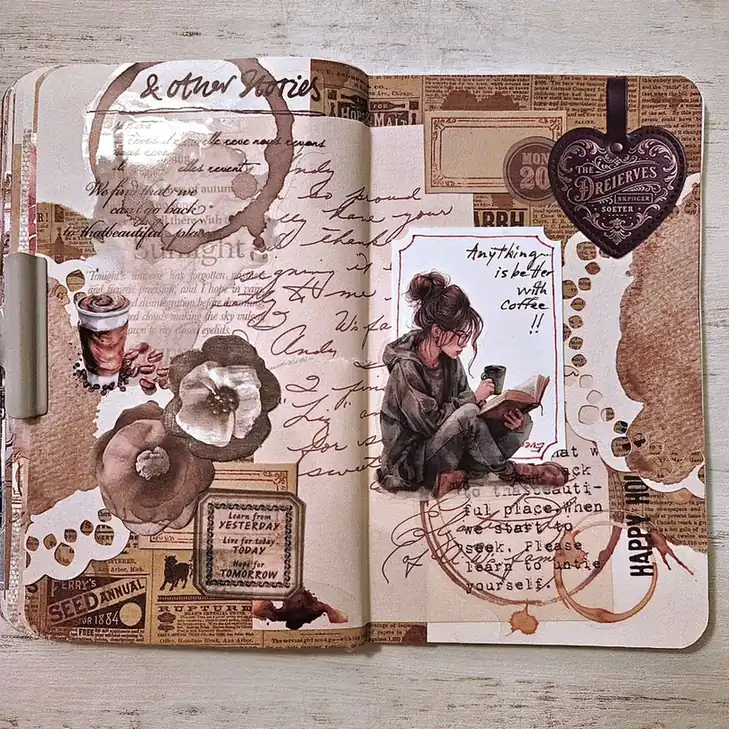
Real coffee did some of the decorating here. Ring marks and brown splotches cover the spread, giving plain paper an old, lived-in look that no sticker can fake.
Underneath sit layers of newspaper print, old handwriting paper, and torn white doilies, which give the page depth. A sticker of a girl drinking coffee with a book rests in a small frame on the right, next to a short coffee quote. Faded flowers, a coffee cup sticker, and a dark heart charm finish it off.
The colors stay tight on purpose: browns, creams, and nothing else.
Test your coffee stains on a scrap first. Dab them on with a cup bottom or sponge instead of pouring, and let the page dry fully before you glue anything on top. Thin journal paper wrinkles and tears when it’s wet.
12. Digital Scrapbook Page for When You Have No Supplies
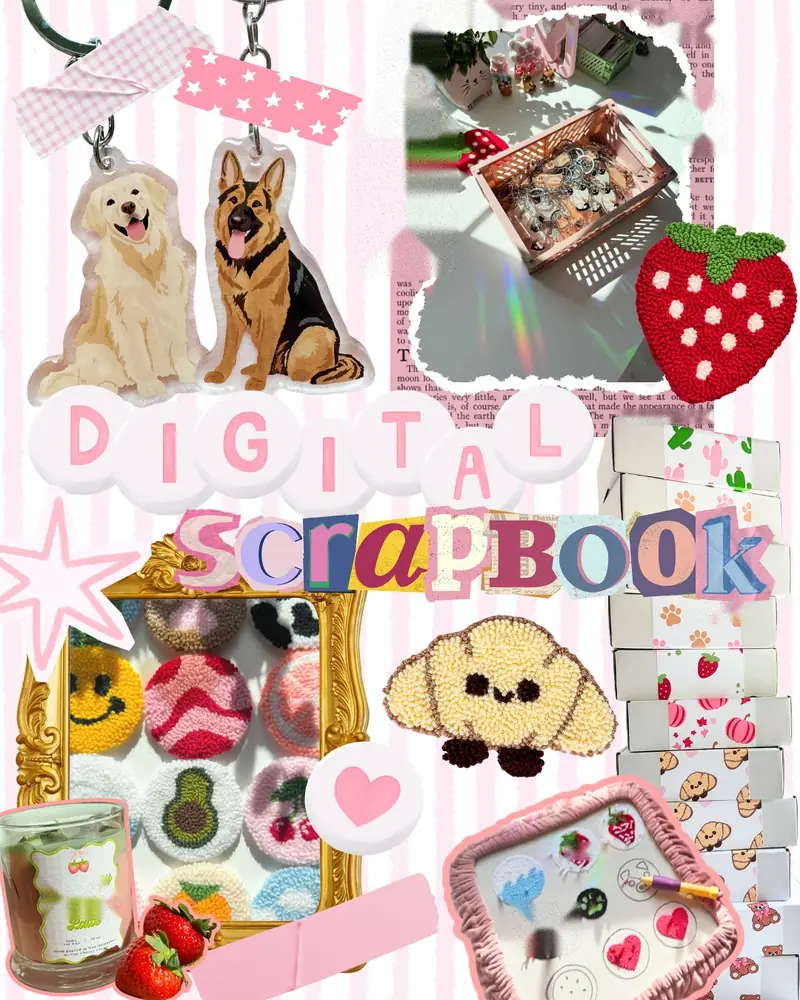
No paper, no glue, no mess. This page was made on a screen, and it still has the cut-and-paste charm of a real scrapbook.
Photos of handmade keychains, punch needle pieces, and craft boxes are cut out with white or torn edges, then layered over a pink striped background. Fake washi tape strips hold things in place. The title mixes two styles: round bubble letters for one word and a ransom-note jumble of letters for the other.
Going digital is a low-risk way to practice layouts. You can move things around as often as you like and undo any mistake. Print it later if you want a paper copy in your album.
13. Monthly Check-In Page With Tuck-In Pockets
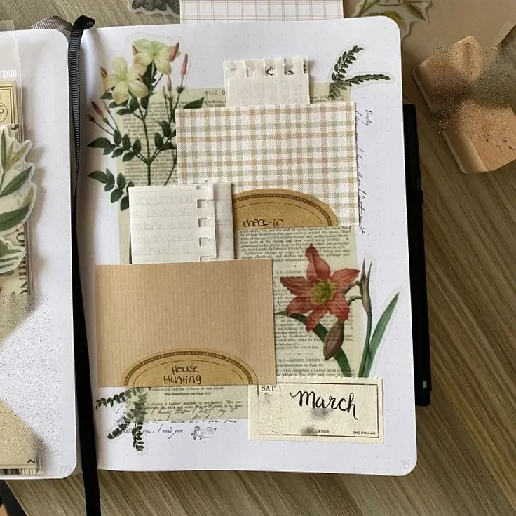
Each month gets one page in this journal, and the layout works like a tiny filing system.
A kraft paper pocket sits at the bottom, with a gingham card and a book page layered above it. Small cards and tab inserts slide in behind, labeled by hand with notes like check-in and house hunting. A ticket-style label marks the month, and tall botanical stickers of a red lily and a white flowering branch frame the sides.
Pockets fix a common beginner problem: where to put all the extra bits. Everything gets a home, and the page stays neat. Easy things to tuck inside:
14. Minimal New Year Spread With Lots of White Space
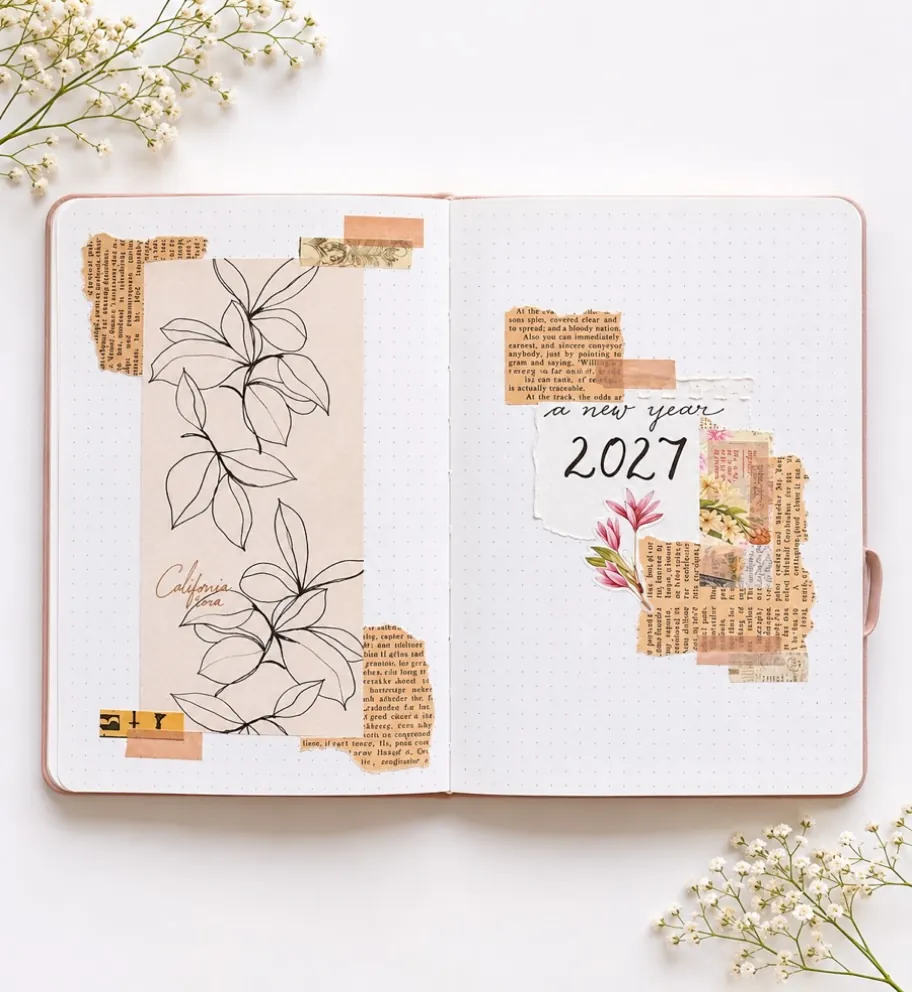
Half of making this page was deciding what to leave out. Most of the dot grid paper stays empty on purpose.
On the left, one tall card with a black line drawing of leaves runs down the page, held by peach washi tape and a few torn book scraps. On the right, a small cluster sits near the top: a torn white label with the new year written by hand, layered over book page bits and one pink flower sticker.
For a nervous beginner, this is the lowest-pressure page on the list. Fewer pieces means fewer decisions, and a hand-lettered year makes a lovely first page for a fresh album.
Empty space gives the few pieces you do use room to look special.
15. One Big Flower Cluster in the Middle of the Page
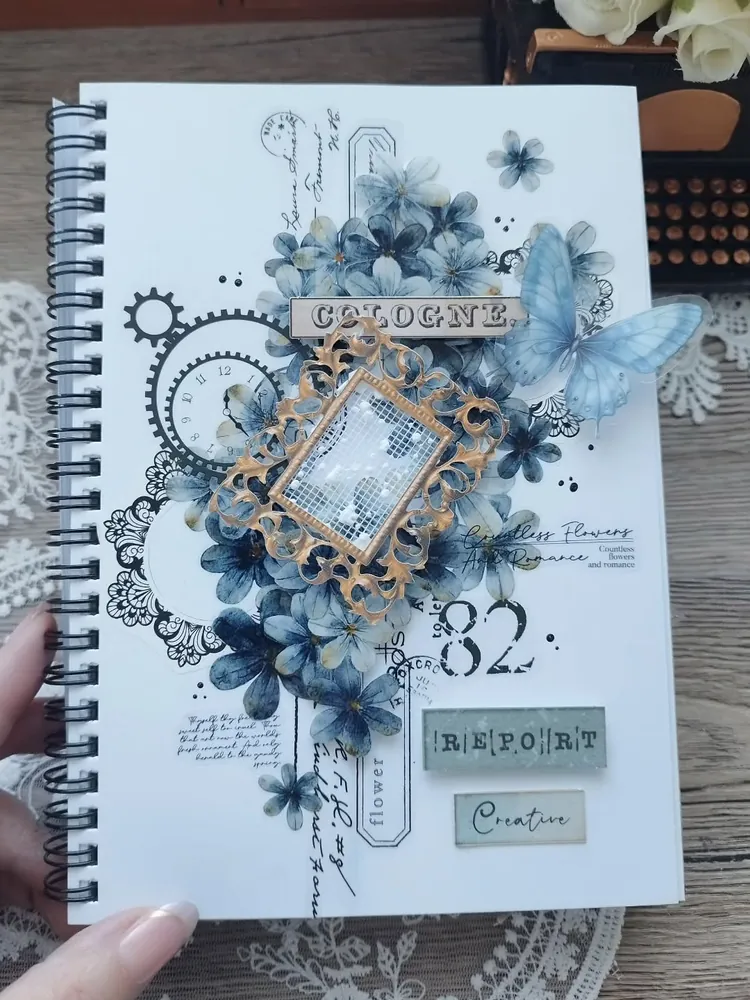
Grouping is the whole idea here. Instead of spreading blue flower stickers across this spiral sketchbook page, the maker piled them into one big cluster in the center.
Around that cluster sit a gold lacy frame, black stamped gears, a clock face, lace patterns, and a pale blue butterfly that peeks over the edge. A few small word labels and a large stamped number sit off to one side. The rest of the white page stays clean.
Clustering is a handy trick when you’re new. When everything touches, small gaps and slightly crooked stickers stop showing.
Stickers placed one by one around the page, with lots of small gaps that make it look unfinished.
The same stickers piled into one tight cluster, with a frame and a butterfly layered on top.
Start With One Page
Your first page doesn’t need to match anything here exactly. Borrow one piece from an idea you liked, like the paper columns, the pull-out strips, or that big flower cluster, and pair it with your own photos.
The best scrapbook page ideas for beginners are the ones you actually finish. Keep your colors simple, glue down the first piece even if it feels wrong, and let the next page be a little braver than the last.
Save this for the next time you sit down with a stack of photos and no idea where to start.