19 Wreath Ideas Using Faux Flowers

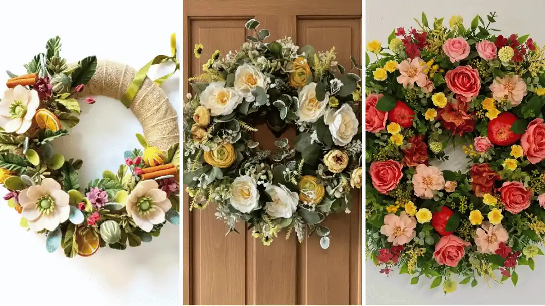
If you have ever stood in front of a wreath display and felt overwhelmed by how similar every option looks, this roundup is built to fix that.
Faux flower wreaths get a bad reputation for looking flat or overly uniform, but the nineteen ideas here prove that is only true when the design stops at “put flowers on a ring.”
Some lean into a loose, gathered look with the base peeking through. Others go dense and color saturated, or build height with grass plumes that break past the usual round shape.
A few skip flowers almost entirely in favor of dried orange slices, pinecones, or hand shaped pipe cleaner blooms.
What ties them together is intention: a deliberate color story, a textural contrast, a base material that adds its own personality instead of hiding under greenery.
Whether you want something polished enough for a formal entry or scrappy enough for a weekend craft afternoon, there is a version here worth studying before you build your own.
19 Wreath Ideas Using Faux Flowers
1. A Cream and Gold Garden Rose Wreath for a Soft Front Door Welcome
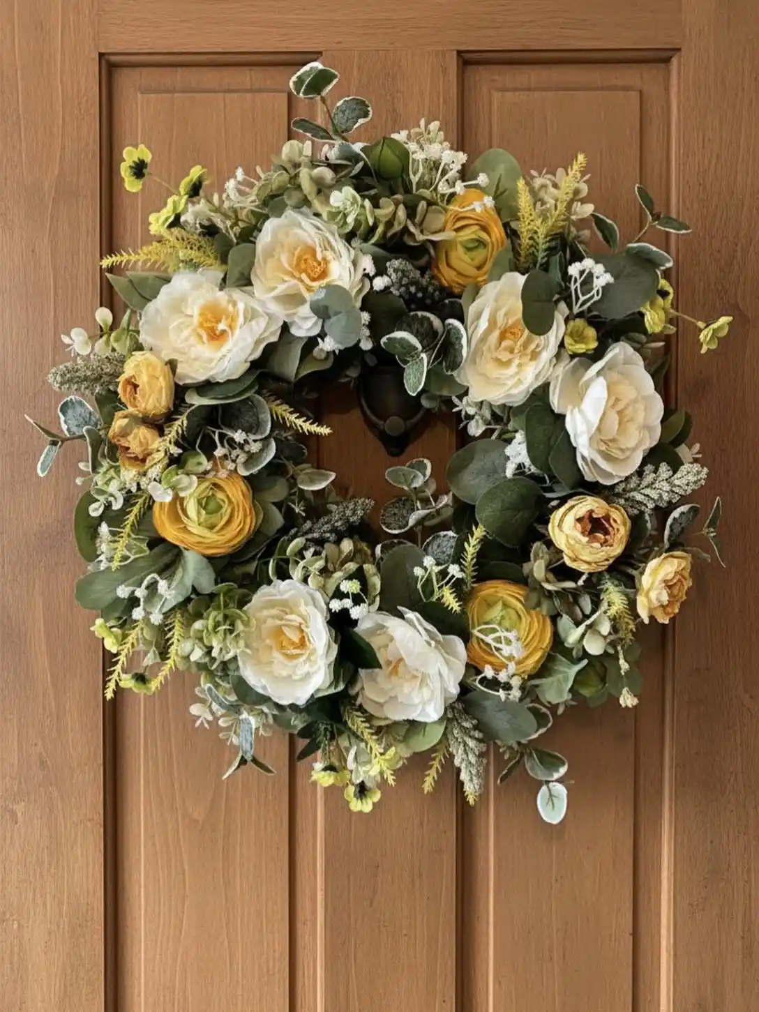
This one leans into a full, garden grown look rather than a tidy, symmetrical shape.
The ivory peony style roses are the anchor, and small yellow ranunculus clusters are tucked in between them so the color reads warm instead of stark white.
Eucalyptus in two shades, some frosted and pale, some deep green, fills every gap so the base never peeks through.
Tiny sprigs of faux baby’s breath and a few feathery yellow filler stems add movement without making the wreath look busy.
It hangs full and round, the kind of shape that reads well from the street. Against a warm wood door, the cream tones pick up the honey undertones instead of clashing with them.
2. A Felt Flower and Citrus Wreath That Skips the Full Coverage Look
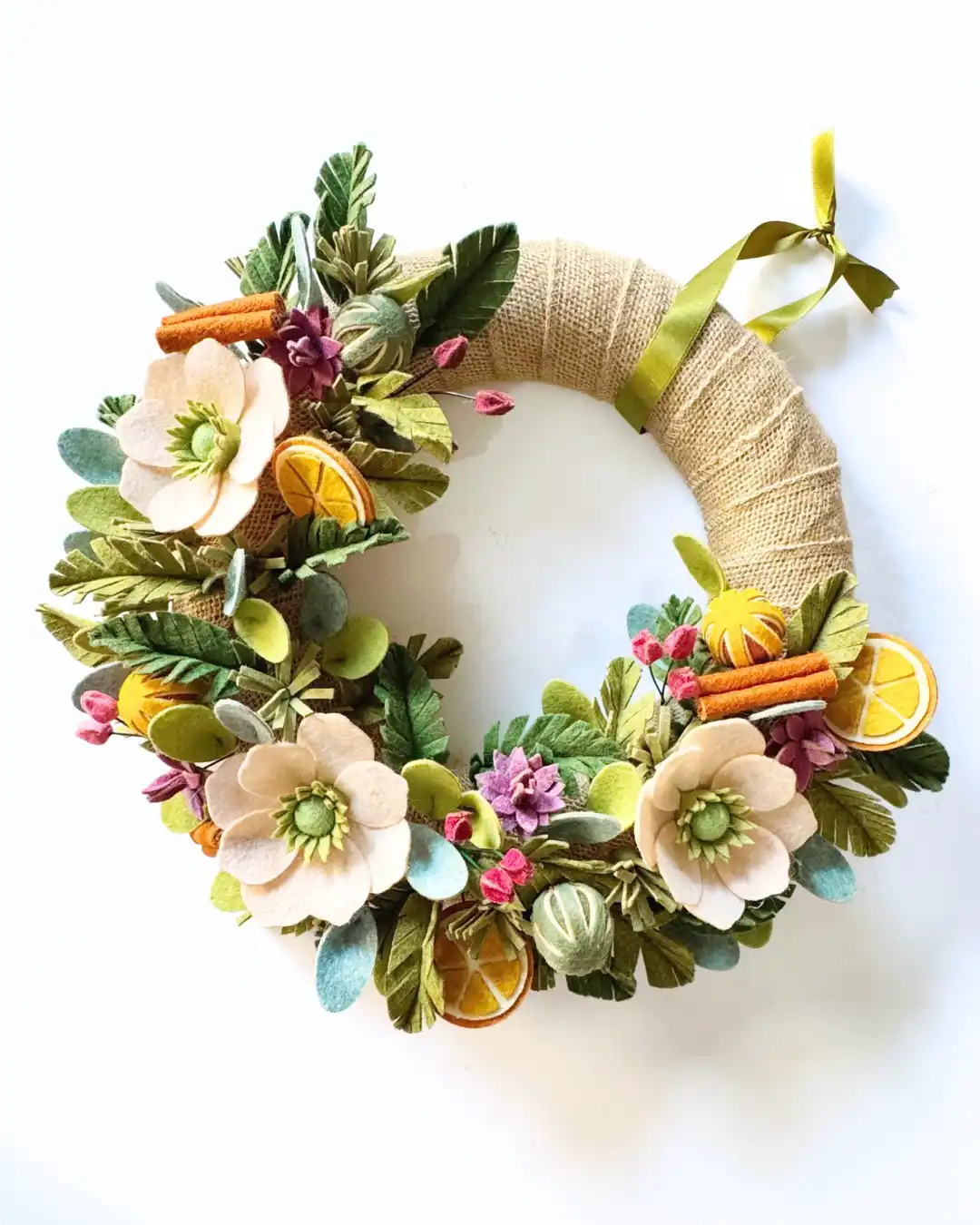
Burlap wrapped base, hand cut felt anemones, and dried orange slices give this one a handmade, kitchen craft feel instead of a polished florist look.
The open crescent shape is the real trick here: instead of filling the whole ring, the greenery and flowers cluster at the bottom left and lower right, leaving the burlap wrap visible as its own design element.
A moss green ribbon at the top doubles as both hanger and accent. Cinnamon sticks and berry clusters tucked between the felt leaves add texture without needing real dried botanicals, so the whole thing stays weatherproof.
3. Coral Roses and Faux Pomegranates for a Wreath With Real Depth
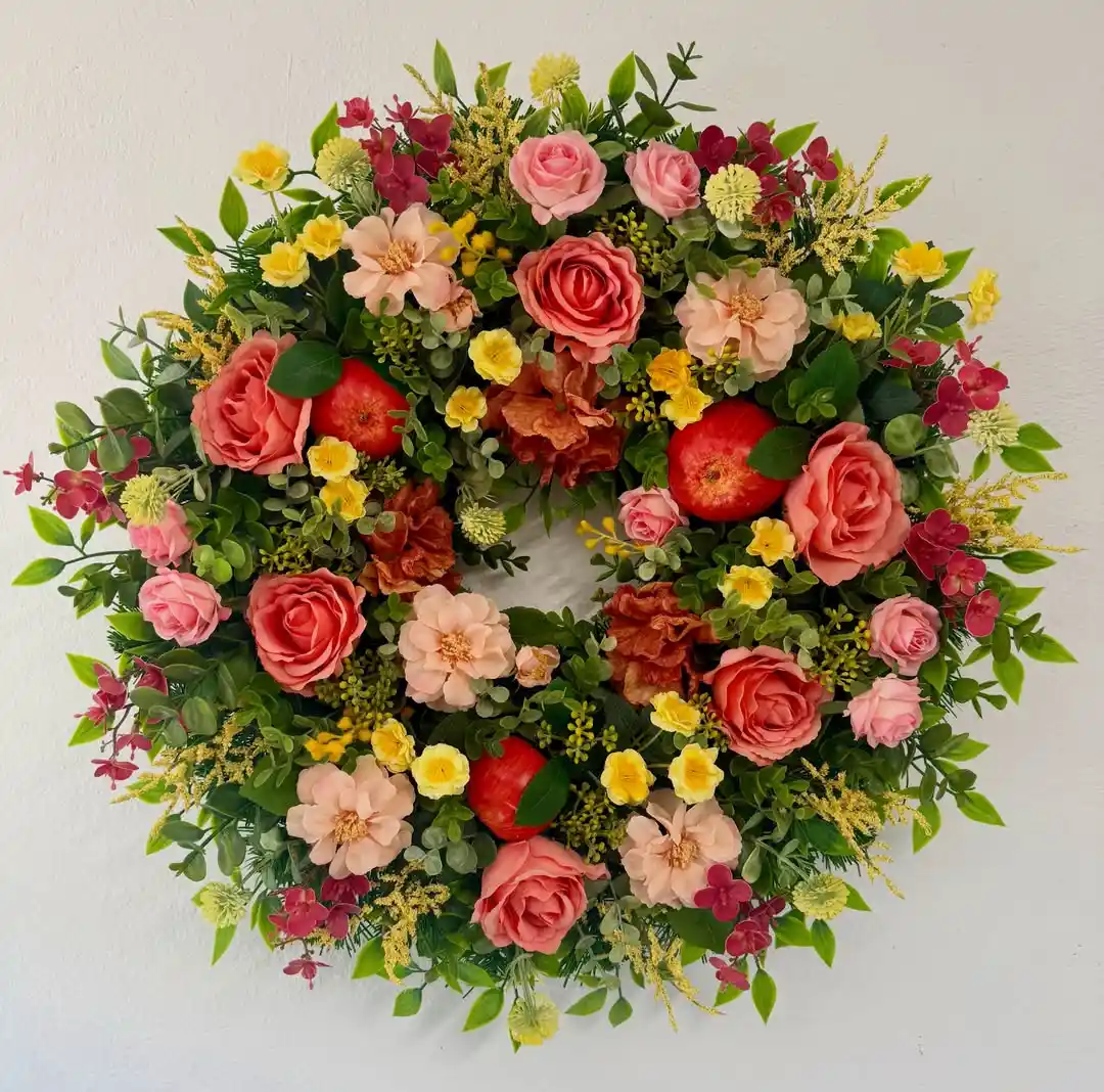
Color density is what sets this one apart from the others. Coral and blush roses sit shoulder to shoulder with hot pink florets, buttery yellow filler blooms, and a few rust colored ranunculus that read almost like dried flowers even though they are not.
Small faux pomegranates, cut open to show the red interior, are tucked between the greenery at three points around the ring, giving the eye something to land on besides petals.
The base greenery mixes ferny sprigs with rounder eucalyptus leaves so no two sections look the same.
It reads more autumn harvest than spring garden, a good pick for anyone who wants a faux wreath that still feels a little wild.
Coral, blush, pink, and yellow blooms mix instead of matching, so the wreath reads full from across the yard.
Faux pomegranates cut open at the center add a punch of red that breaks up the floral pattern.
Fern sprigs and rounder eucalyptus leaves keep the base from looking flat or repetitive.
4. Sage Green and Ivory Roses for a Wreath That Reads Almost Monochrome
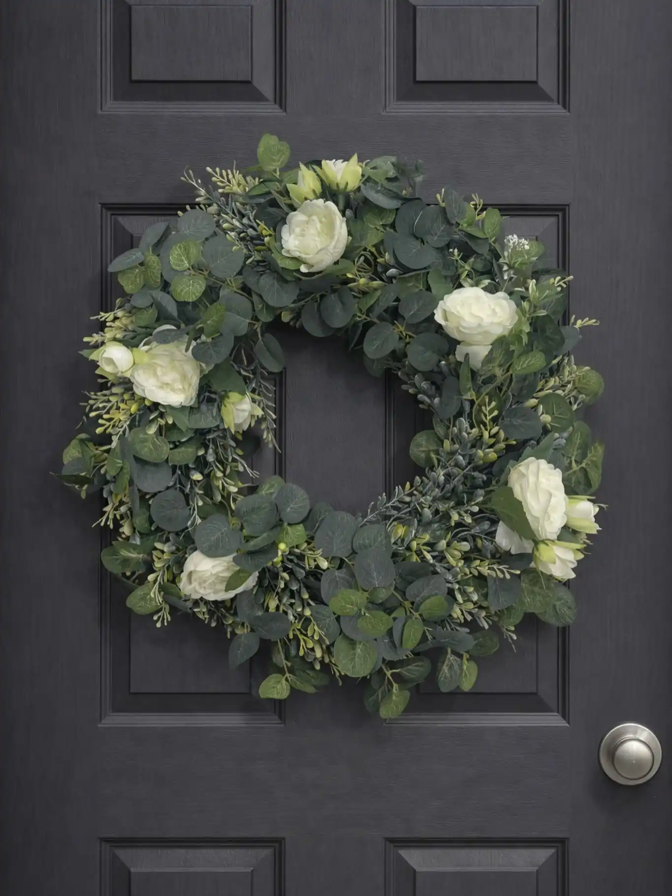
Five full ivory rose blooms sit spaced evenly around a dense eucalyptus base, and that restraint is what makes this one work.
No filler flowers, no bright accents, just cool toned greenery in two shades against soft white petals.
The eucalyptus is layered thick enough to look wild rather than trimmed, with a few silvery, frosted leaves mixed through the deeper green ones to keep it from reading flat.
Against a dark painted door, the whole thing reads almost sculptural. It’s the pick for someone who wants a wreath that looks expensive without touching a single bright color.
A limited color palette makes faux greenery look intentional instead of store bought.
5. Sunflowers, Ranunculus, and a Lemon Print Bow Turn This Into a Full Statement Piece
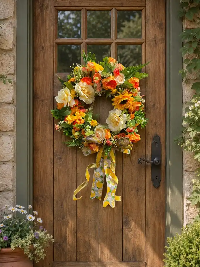
Sunflowers give this one its personality, but they’re not doing all the work alone. Cream roses, orange ranunculus, and a scatter of small marigold blooms build out a warm, sunset toned palette that reads as summer rather than fall despite the sunflowers.
Fern fronds and a few trailing greenery stems soften the bottom edge so the wreath doesn’t feel too round or too tight.
The real standout is the oversized bow at the base, a burlap and lemon print ribbon combo with long tails that adds movement and pulls the eye down past the flowers.
On a wood door with stone surround, the whole thing looks like it belongs on a farmhouse porch in July.
6. A Burgundy Peony Wreath With a Wooden Welcome Sign at Center
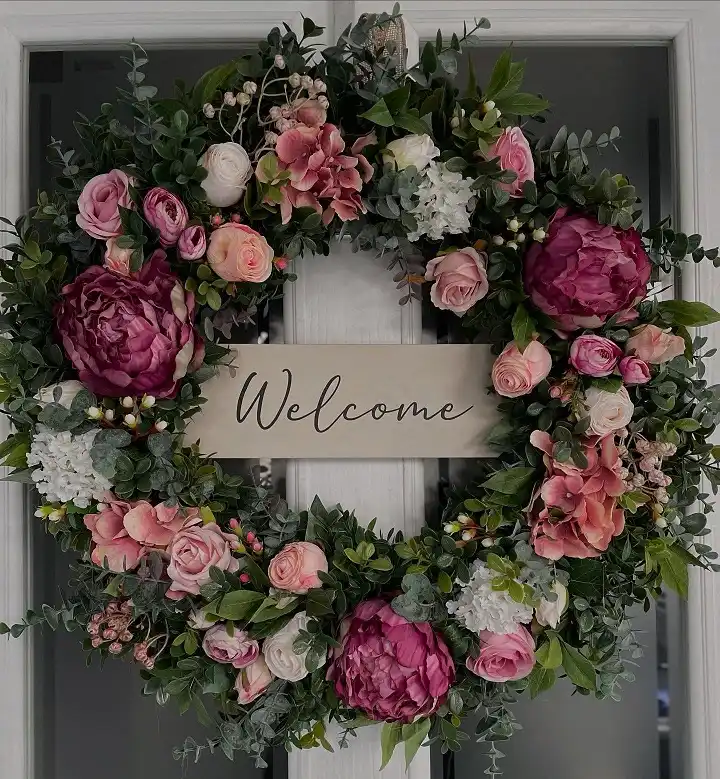
Deep burgundy peonies anchor the four corners of this wreath, and dusty pink garden roses fill in the space between them so the color never tips too dark.
White hydrangea clusters break up the richness at two points, keeping the whole thing from reading heavy.
A cursive wood sign sits right in the middle of the ring instead of off to one side, turning the wreath into a functional greeting rather than just decoration.
Subscribe to DIY Craft Bloom
Get updates on the latest posts and more from DIY Craft Bloom straight to your inbox.
The eucalyptus base is trimmed close and even, which lets the sign stay legible without leaves crowding the letters.
Keep the greenery trimmed close around a center sign or the letters get lost, especially once the flowers are wired in place.
7. Lavender Hydrangea and Ivory Peony Roses Alternate Around the Ring
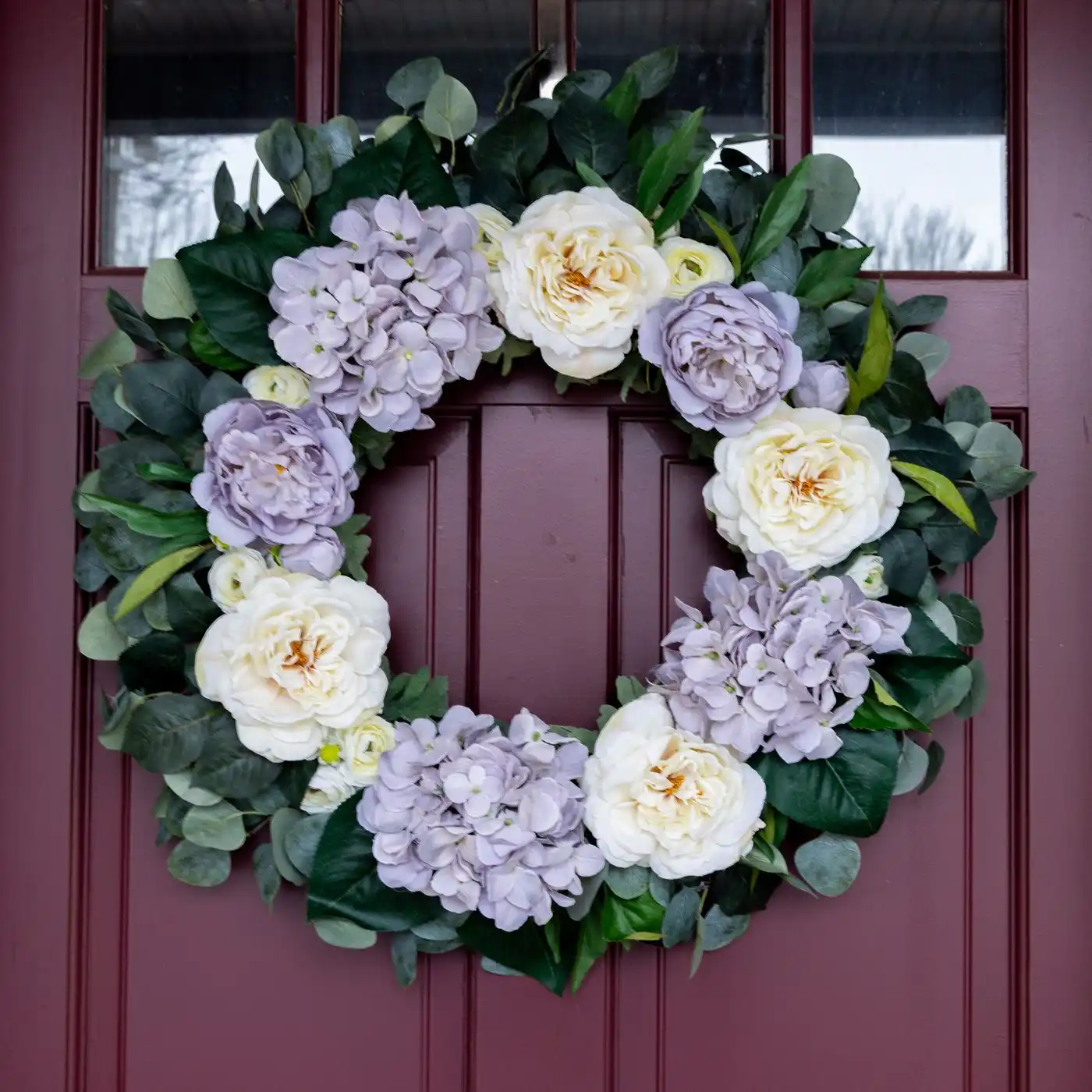
This one works on rhythm. Lavender hydrangea clusters and pale purple peonies alternate with full ivory garden roses all the way around, so the eye keeps moving instead of settling on one focal point.
Dark, glossy leaves form the base instead of the softer eucalyptus seen in most faux wreaths, which makes the pastel flowers pop harder against the deep green.
Against a deep burgundy door, the lavender tones read cool and a little formal, more suited to a dinner party entrance than a casual porch.
Small ranunculus buds tucked near the hydrangea heads keep the clusters from looking like solid blobs of color.
One flower type repeated, single soft greenery, low contrast between blooms and base.
Hydrangea and peonies alternate on dark glossy leaves, giving the pastels real contrast to pop against.
8. Pastel Tulips and Speckled Eggs Turn This Into a Full Spring Statement
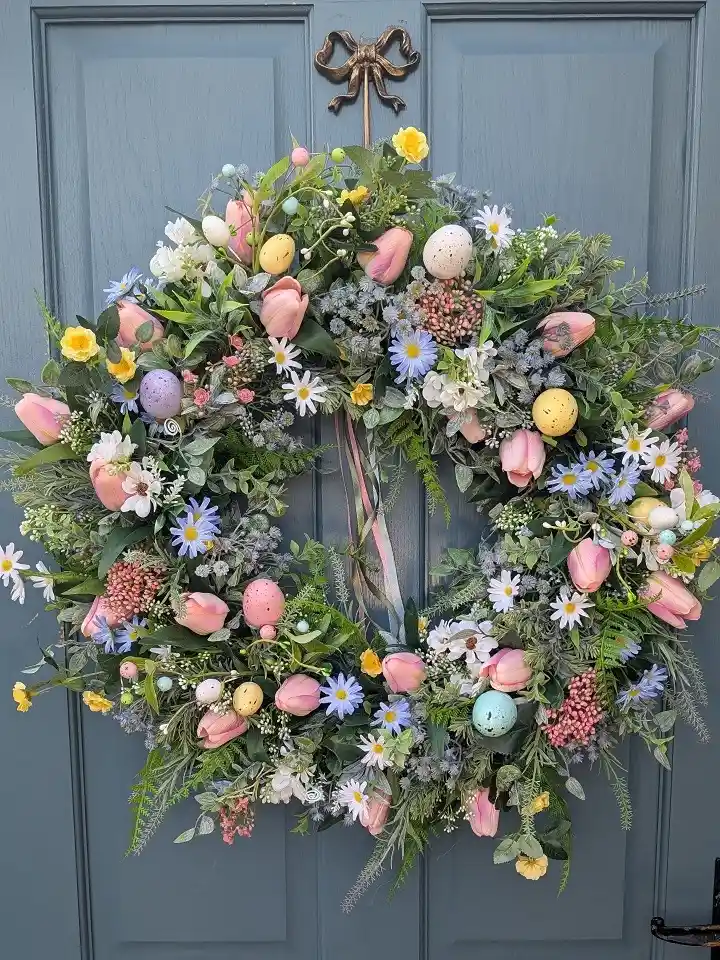
Pink tulips are the backbone here, dozens of them tucked at every angle through a base of frosted eucalyptus and lamb’s ear.
Daisies in white and periwinkle fill the smaller gaps, and hand painted speckled eggs in blush, lilac, and seafoam sit scattered through the greenery like they were left there by a bird.
A slim ribbon in muted pastels hangs loose down the center instead of being tied into a bow, and a small brass bow ornament sits at the very top as the actual hanger.
It’s built for Easter specifically, but the palette is soft enough to work through most of spring.
9. A Loosely Woven Base Left Visible Beneath White Hydrangea and Grey Berries
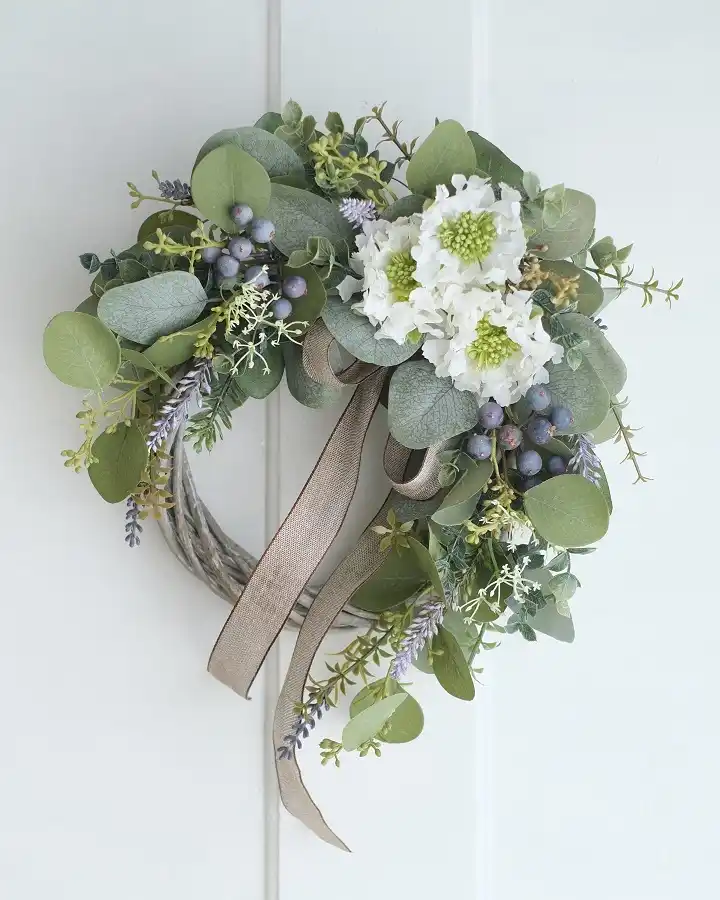
Unlike the fuller wreaths in this list, the twisted vine base on this one stays partly exposed at the bottom, giving it an airy, undone quality that reads more like a floral arrangement than a solid ring.
White snowball hydrangea with chartreuse centers sits just off center as the focal cluster, backed by frosted eucalyptus and clusters of dusty blue faux berries that look almost real from a few feet back.
Sprigs of dried lavender and a trailing champagne ribbon add the only warm notes in an otherwise cool, muted palette.
It’s a good option for anyone who wants a wreath that looks gathered rather than arranged.
10. Small White Wildflowers Scattered Through a Wispy, Textured Base
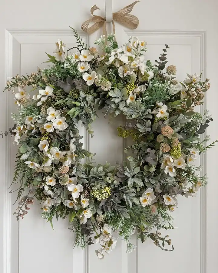
Instead of a few large focal blooms, this wreath uses dozens of small five petaled white flowers spread evenly across the whole ring, so no single spot pulls more attention than another.
The base mixes at least four different greenery textures: soft lamb’s ear leaves, wispy ferns, dusty seed pods, and a scattering of dried looking round pods in tan and sage.
That texture variety is what carries the design since the flowers themselves are simple and small.
A wide burlap style bow at the top keeps the neutral palette going all the way through, with no single accent color breaking the earthy tone.
11. A White Wicker Base Peeks Through Beneath Pink Roses and Chartreuse Dahlias
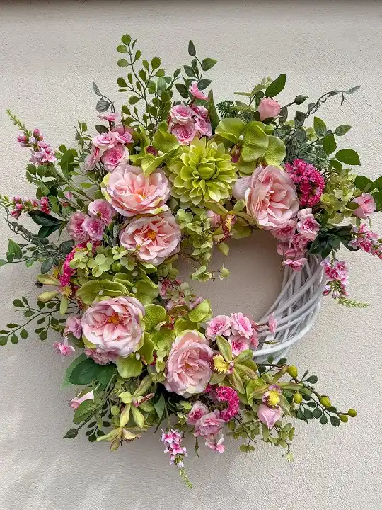
This is the only one on the list where the actual wreath base, a whitewashed wicker ring, stays visible along the bottom right instead of getting fully hidden.
Pink garden roses cluster thick across the top and left side, but a lime green dahlia sits almost dead center as an unexpected color break from the pink and green palette.
Tiny magenta astilbe-style florets and a few sprigs of pink Queen Anne’s lace fill the smaller gaps without competing with the roses for attention.
Letting part of the wicker show gives the whole thing a lighter, less stuffed feel than a wreath packed edge to edge.
12. Coral Ranunculus as the Only Warm Note in a Muted Green and Mauve Wreath
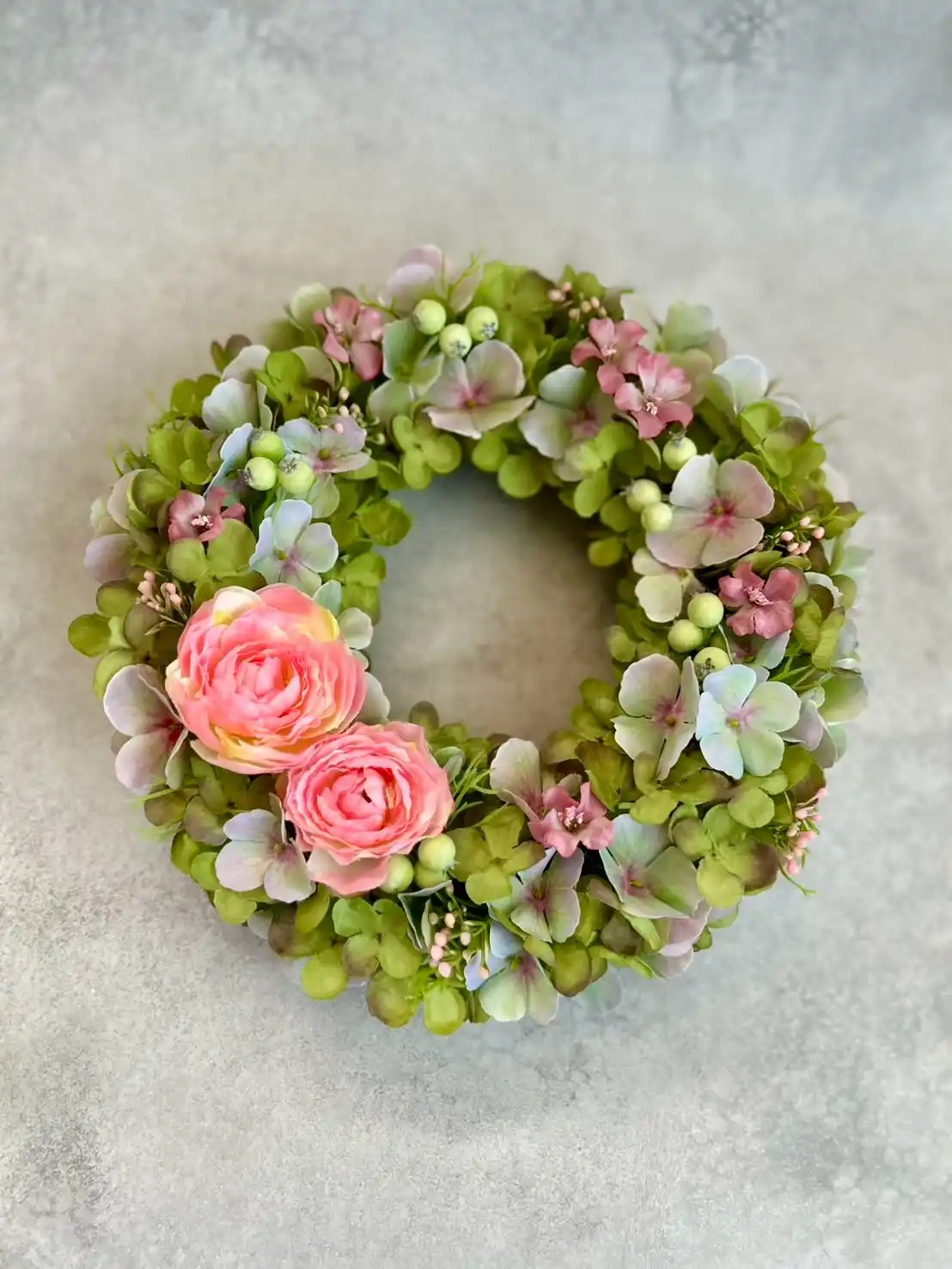
Sage green hydrangea forms the bulk of this wreath, but it’s not the plain green expected from filler foliage.
It shifts through dusty mauve and pale blue as the light hits it, closer to a dried hydrangea look than a fresh one.
Two coral pink ranunculus sit low on the left side, the only saturated color in the whole piece, and that restraint makes them read as the clear focal point even though they take up a small fraction of the space.
Tiny mauve florets and pale green berry clusters scatter through the rest, keeping the muted palette from feeling flat.
Shot on a raw concrete backdrop, the whole thing leans more editorial than farmhouse.
Let the muted greenery cover most of the ring so a small pop of color reads as intentional.
Cluster the bold blooms in one spot instead of spreading them out.
Don’t add a second bright color or the coral loses its punch.
Don’t skip the mauve filler florets, they’re what softens the transition.
Subscribe to DIY Craft Bloom
Get updates on the latest posts and more from DIY Craft Bloom straight to your inbox.
13. Deep Plum Iris and Pinecones Bring a Moody, Late Autumn Feel
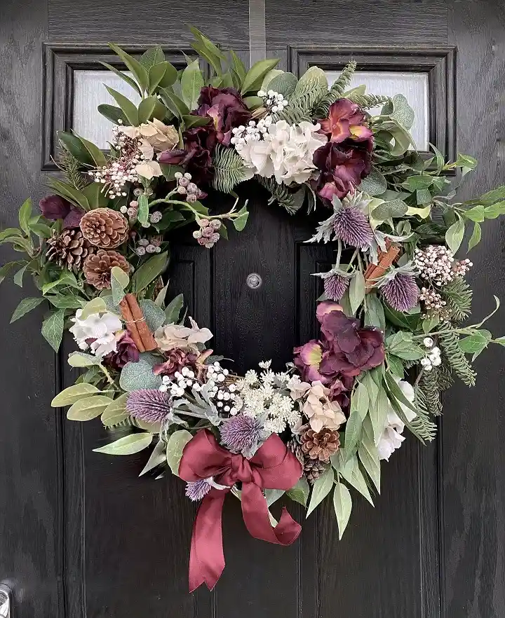
Dark plum iris blooms and burgundy hydrangea give this wreath its weight, backed by ivory garden roses and white astilbe to keep it from turning too somber.
Real looking pinecones cluster in two spots, one on each side, adding a rustic, foraged texture that the florals alone don’t provide.
Purple thistle heads and cinnamon sticks tucked near the bottom repeat the plum and brown color story in a different form.
A wine colored velvet bow with long tails anchors the base and matches the darkest blooms exactly, tying the whole thing together instead of adding a new color. Against a nearly black door, it reads dramatic rather than dark.
14. Pipe Cleaner Flowers Turn This Into an Actual Weekend Craft Project
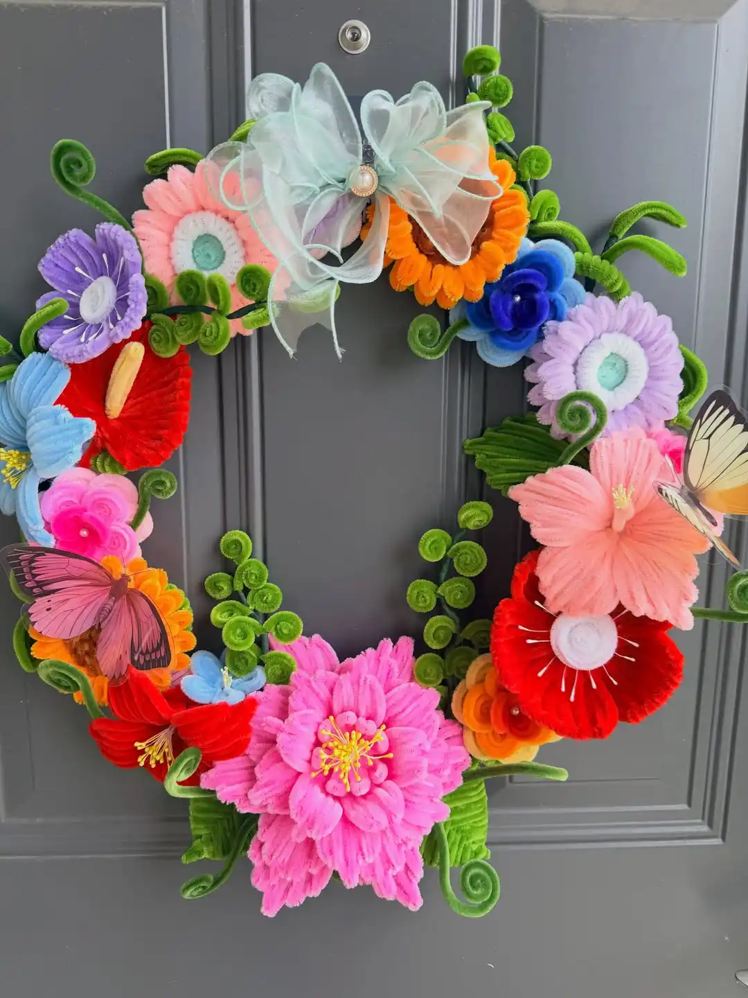
Every bloom here is hand shaped from chenille stems rather than pressed silk, which makes this the one entry on the list a beginner could realistically recreate at home.
The rainbow palette skips any attempt at coordination on purpose, purple, red, blue, orange, and hot pink all sit next to each other, held together by curled green fern tendrils that loop and spiral instead of lying flat.
A sheer mint bow with a small pearl center sits at the top, and two paper butterflies pinned into the greenery add a playful, kid-friendly touch. The texture alone sets it apart from every silk or felt wreath earlier in this list.
15. A Rustic Twig Wreath Left Bare at the Top, Flowers Weighted at the Bottom
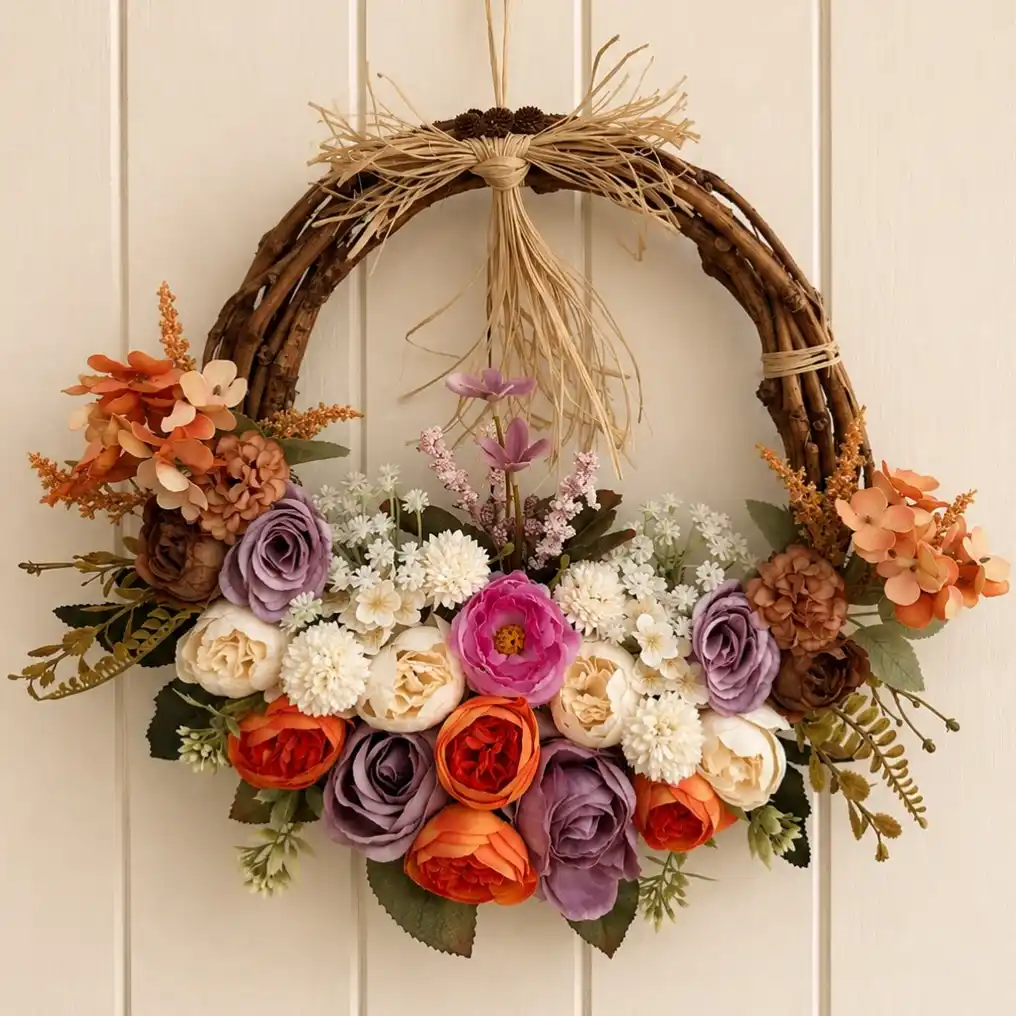
Grapevine and twig make up the visible top half of this wreath, tied off with a raffia bow and a few tucked pinecones, so it reads more like a wall hanging than a full floral ring.
All the weight sits at the bottom in a dense half-moon of purple, orange, and cream roses, with dried looking hydrangea and astilbe spilling out to either side.
Sprigs of lavender and pink heather rise up through the center of the arrangement, adding height instead of letting the flowers stay flat against the twig.
The unfinished top half is the whole point here, giving it a gathered, autumn foraged look that a fully covered wreath can’t match.
Leaving the twig base exposed only works if the flowers stay heavy at the bottom. Spread evenly, the empty top just looks unfinished instead of intentional.
16. A Bare Gold Hoop Says as Much as the Flowers Do
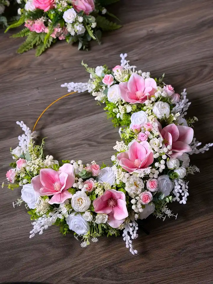
Unlike every wreath so far, this one uses a slim gold metal hoop instead of a grapevine or foam base, and roughly half of it stays completely uncovered.
Large pink magnolia blooms sit as the focal flowers, backed by dozens of small white spray roses and thick clusters of baby’s breath that read almost like lace once bunched together.
The floral half curves into a crescent rather than spreading evenly, so the finished piece looks intentionally lopsided instead of symmetrical.
It’s a good option for anyone hanging a wreath somewhere the plain hoop half can face a wall or door edge, since it isn’t meant to be viewed as a full circle.
| Full coverage wreath | Gold hoop crescent |
|---|---|
| Reads the same from every angle. | Has a clear front and back, works best hung against a wall edge. |
| Uses more flowers and greenery overall. | Half the materials go further since only one side is filled. |
| Base is fully hidden. | The bare hoop becomes part of the design. |
17. Dried Orange Slices and Cinnamon Sticks Read More Kitchen Craft Than Florist Shop
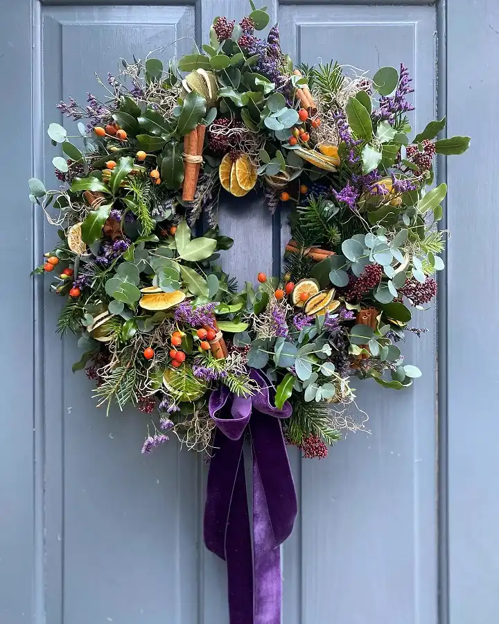
This is the most ingredient heavy wreath on the list. Dried orange rounds and cinnamon stick bundles sit throughout a mixed evergreen base, joined by orange berry clusters, purple heather sprigs, and wispy curls of raffia that catch the light between the greenery.
No single large bloom anchors it, which keeps the eye moving across all the small details instead of landing on one spot.
A wide purple velvet ribbon with long trailing tails hangs from the bottom, adding weight and length that pulls the design past the ring itself.
It leans firmly into a foraged, holiday market look rather than a garden florist one.
18. A Color Gradient Wreath That Moves From Deep Red to Bright Yellow
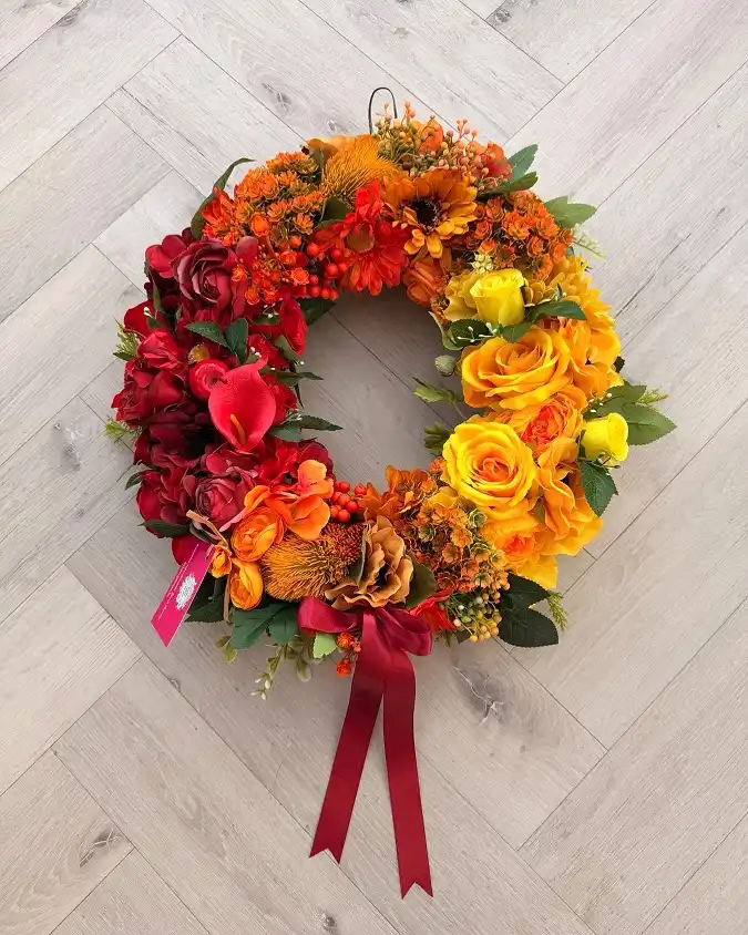
Instead of mixing colors evenly, this wreath is built as a deliberate gradient, deep red roses and calla lilies on the left, shifting through orange sunflowers and marigolds at the top, landing on bright yellow roses by the right side.
That ombre effect does more visual work than any single flower choice could. A thin wire hanger stays visible at the top rather than being hidden by foliage, and a wine red ribbon at the bottom picks up the darkest color from the opposite end of the wreath, tying the gradient back together.
It’s built for a fall front door, but the gradient technique itself could work in any season’s color palette.
Cluster the deepest red blooms together on one side to anchor the gradient.
Sunflowers and marigolds carry the transition through the top of the ring.
Bright yellow roses finish the far side, giving the eye a clear endpoint.
19. Wispy Grass Plumes Add Height That Most Faux Wreaths Skip
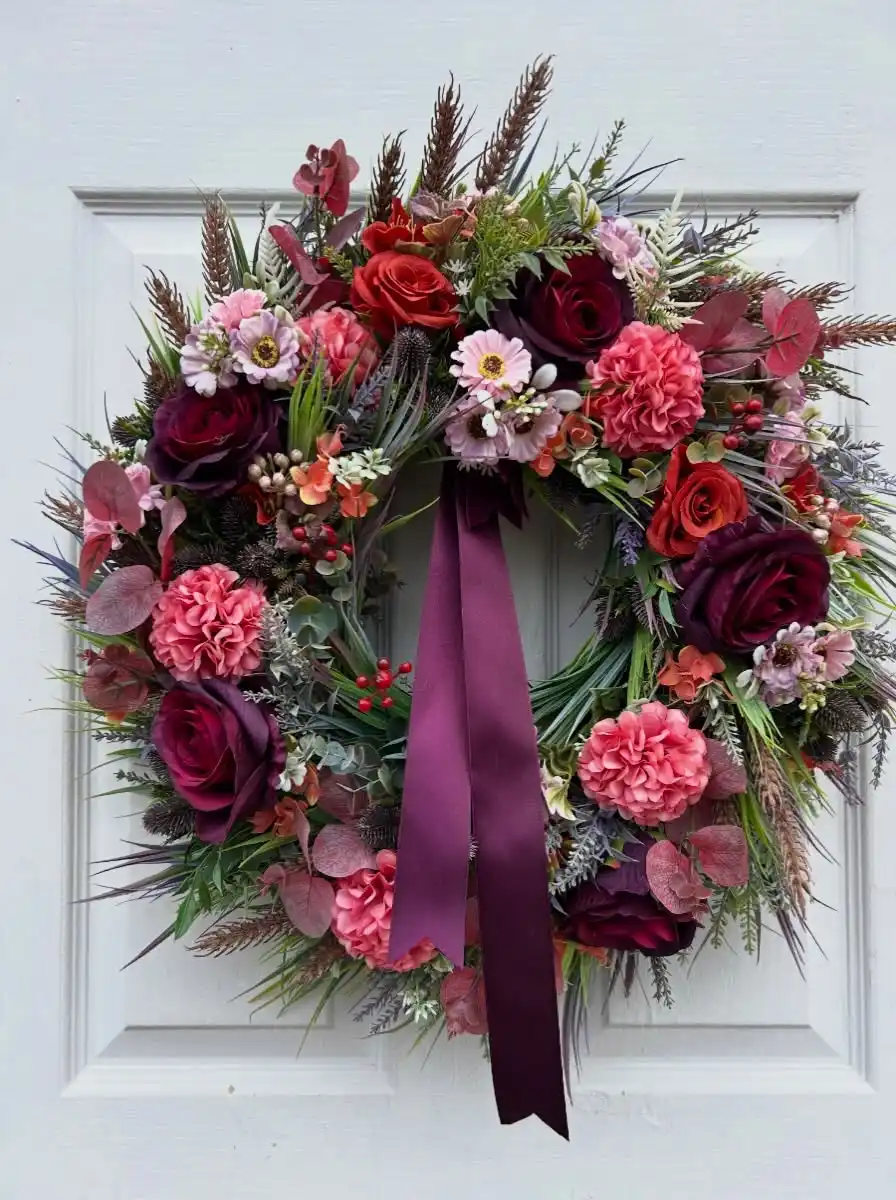
Tall feathery grass stems shoot up above the top of the ring here, something none of the earlier wreaths on this list attempt, and it changes the whole silhouette from round to something closer to a bouquet shape.
The florals underneath run deep jewel tones, wine roses, coral carnations, and dusty pink zinnias, with red berries and thistle heads adding texture between the larger blooms.
Sage colored eucalyptus with a slight purple cast ties the cooler and warmer flowers together instead of letting them compete.
A matching plum satin ribbon hangs long and straight down the center, echoing the darkest rose shade without adding a new color to track.
conclusion
That covers all nineteen. Save this for the next time you want fresh wreath ideas that actually look different from each other, not just the same ring with a new flower swapped in.
If a particular base style or color story catches your eye, it is worth screenshotting before you start shopping for stems, since matching the right texture mix matters more than any single bloom choice